How to Do Composition for Advertising Photos

Advertising is likely the photographic field with the highest cashflow. Photobanks sell millions of photos of countless types each day. But in this article we won’t be discussing how to shoot for photobanks. Instead we’ll focus on the basics of composing commercial photos.
Composition is the foundation of photography. Advertising photos follow the same rules as any others, but you also need to observe a few more rules that are typical for this type of photography. To discover them, read on.
Information
As the photographer, you should know what will be in your photo, and how and where it will be used. Knowing these things will make it much easier for you to shape the photo appropriately. If you don’t know these things, ask your client about them.

YOUR TEXT HERE
Advertising billboards with no text have little to say. They exist to gain the interests and sympathies of crowds of people. So take photos that play well with advertising text.
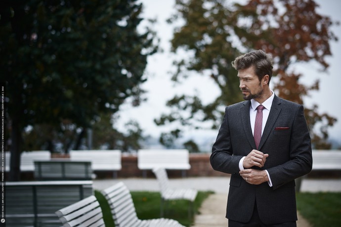
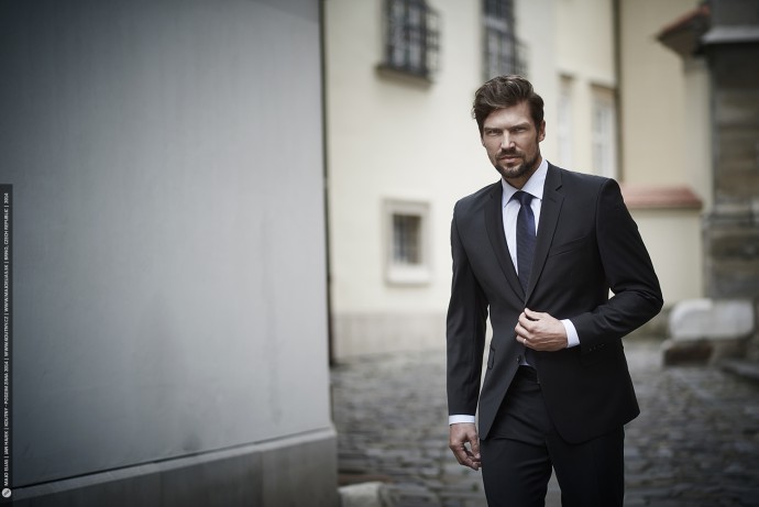
Keep in mind that if there are too many colors mixed together in the background, the text will be unreadable. So lean towards solid and, if possible, neutral colors for your backgrounds. In short, in advertising photos, leave more free space than usual.

Have Pity on the Graphic Artist
Often an ad will use only part of your original photo. The rest will be filled in by a graphic artist. So it’s good to know how the final product will look. Once you know, take a picture that enables the graphic artist to easily use just the relevant part, via masking or cropping. Politicians’ billboards in election campaigns are a typical example here.

Crop Ratios
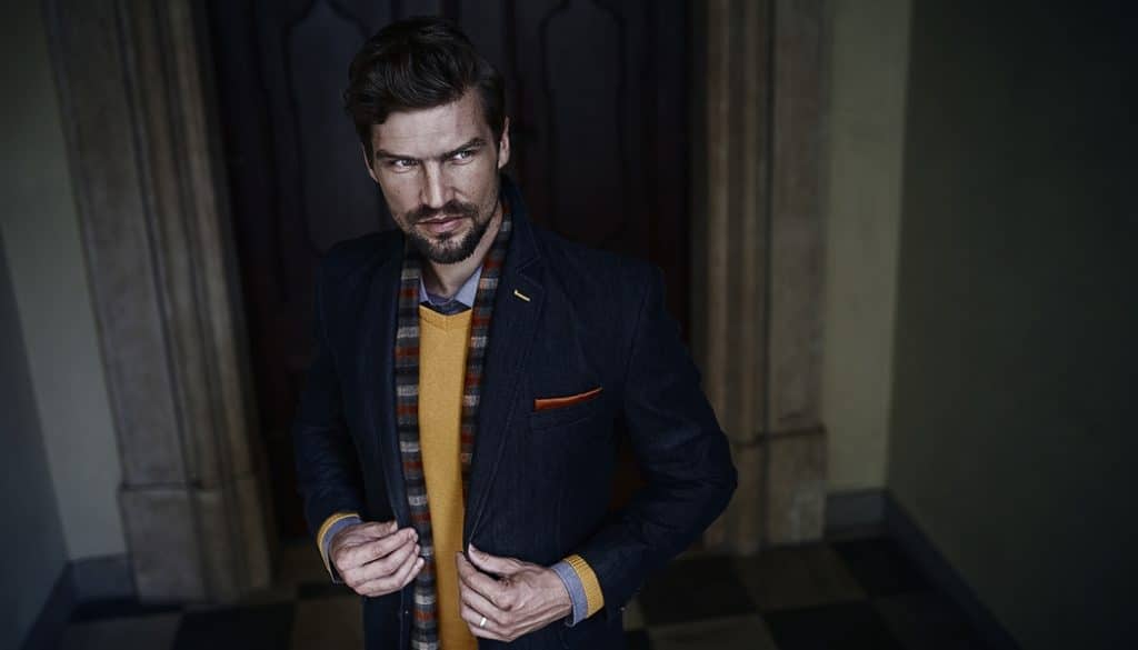
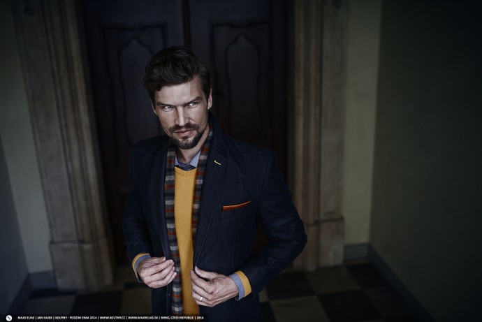
Only rarely do your photos look the same on billboards as they did when you took them. Almost all billboard photos have a different crop ratio than 3:2. Most billboards use very wide, almost panoramatic pictures. This format helps ensure that billboards have plenty of room for text or a company logo. Occasionally you’ll also see photos shot in portrait orientation. But these are much rarer than landscape photos.
Something More
Keep your photos’ technical quality in mind as well. Shoot exclusively to RAW. You never know how large a print will be needed. Try to maintain maximum technical quality as well.

Advertising surrounds us on all sides. Whether we want it or not, that’s the way it is. But when you see it, don’t just see it as advertising. See it like a photographer; see it as art. Notice the compositions, the executions, the graphic design. Let other people’s art inspire you. Perhaps someday, thanks to that inspiration, it will be your billboard photos that people will be passing by.

There are no comments yet.