Improve Your Kid Portraits Using Landscape Compositions
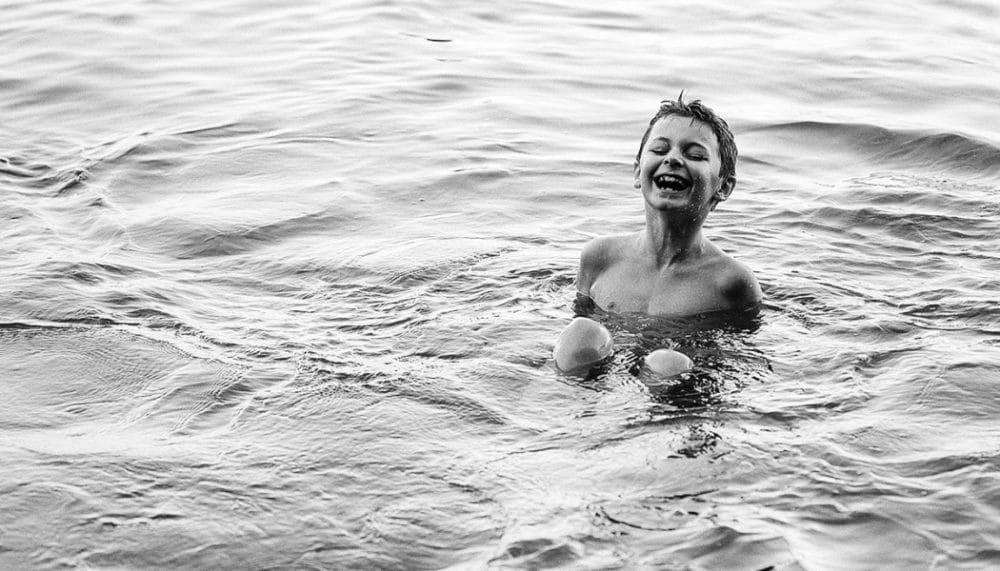
When most photographers hear the word “composition,” they think of landscape photographs. But we’ll show you that you can use these same guidelines when photographing kids.
Even experienced photographers who know the rules of composition and utilize them in practice can run into trouble when photographing kids—they just won’t sit still. Capturing the moment while also pleasingly arranging the picture’s elements tends to be tougher than it is for static photos. And yet meanwhile, interesting compositions can make a picture special and make it stand out from the flood of other kid photos.
As a photographer grows, so does their composition—from a boring constantly centered take, out towards the borders. Sometimes the subject can even end up all the way at the edge of their photos. But it’s best to wait to experiment until you’ve learned the basics of composition.
Centered Composition
Books and articles often refer to centered composition as “boring” or “uninteresting.” It can be a sign of a photographer who has yet to grow. But it can also be entirely deliberate, as a way to emphasize symmetry. Especially in combination with a square crop, a picture like this will exude a balanced, calming feeling.
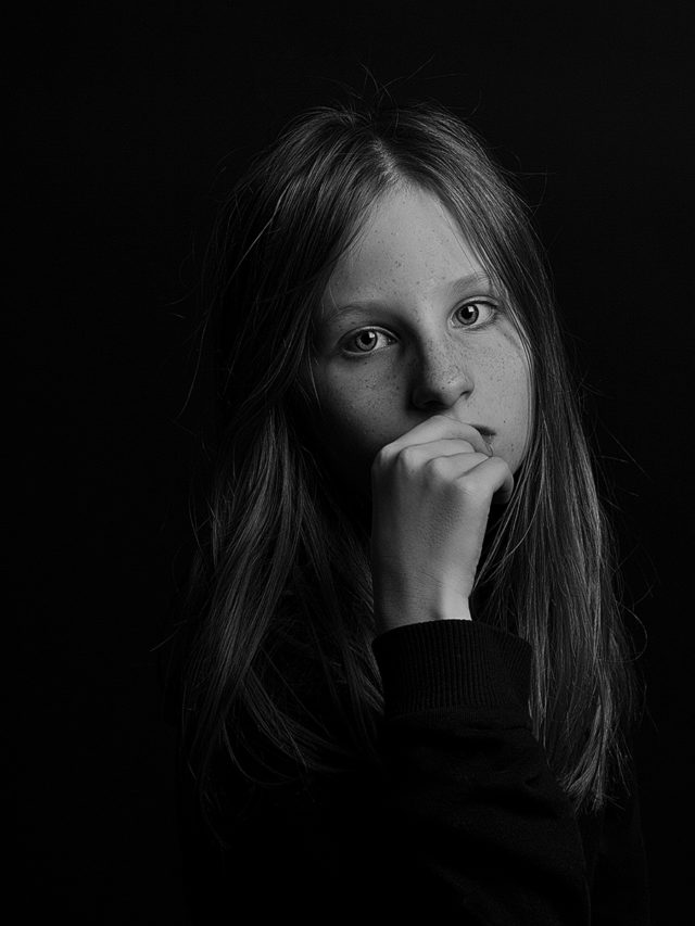
When you’re shooting a close-up of a face, you need to be guided by where the eyes are. If they’re in the center of the picture, that’s a centered composition. If they’re about a third of the way in, then that is rule-of-thirds composition.
Dividing It Into Thirds
An imaginary division of a picture into three equal parts from left to right and from top to bottom gives two imaginary verticals and two horizontals. If you shift the subject from the center of the picture towards these guidelines, you get a more dynamic photo. No matter whether the child you’re photographing is walking or running, a rule-of-thirds composition will always create some tension in a picture. Especially when the child is the picture’s only significant element.
Placing the child one third of the way into the photo produces more space on the other side. You can either fill it up with an object, element, or another person, or you can leave it empty. So-called negative space is a powerful tool for composition. That’s because empty space is the strongest at pulling attention back to a photo’s main element and letting it shine.
The crossing of the imaginary verticals and horizontals produces four intersections often referred to imprecisely as “golden crop” points. It’s not important here to know the definition of the golden crop, but you should know that you can place your subject on any of these four points and get a good-looking photo.
Although you can adjust composition after the shot in Zoner Studio, which even offers visual guidelines for the golden crop points, it’s always best to think everything through in advance. And to get the right composition before you press the trigger.
Diagonal Composition
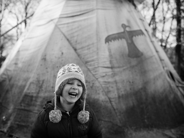
Lines leading from one top corner of a picture to the other side’s bottom corner matter the most for landscape photography. But that doesn’t mean they don’t have a place in portraiture. If you study enough photos that have their main element on one of the golden-crop points, you may discover that some of them goad your eyes onward to the opposite intersection.
Diagonals are a great tool for adding dynamism to a photo, which you’ll especially appreciate in reportage photography. For example when depicting the relationship of a child to their dog. A photo where they are both on one golden-crop point will feel different than one with diagonal composition.

Taking Advantage of Focus Points
Many photographers use the camera’s center focus point when composing a shot. They take all their pictures, dynamic or static, via “press, recompose, and click.” If you’re used to taking photos like this and it suits you well, then there’s no need to change.
Nevertheless, this method may not always give the best results. For example when shooting a portrait with a very small depth of field or during quick action. So you might also want to try working with other focus points and using other features in your camera such as continuous-servo autofocus (on Nikon this is AF-C) or focusing using AF-ON.
I personally use continuous-servo AF very often when photographing children in motion. I keep the selected focus point, which focuses continuously, on the child’s face (their eyes) and watch the scene with the trigger held down. Once their expression interests me, I already have everything composed and focused, and all that’s left is to press the trigger.
Where to Shoot From
Your composition plans should also include the position from which you’ll be taking the pictures. A well-known rule states: “Always photograph children from eye level.” In many cases this really is the best position. It’s easier for the child to see you as one of their “gang,” and their body will have the proper proportions, since you’re using the proper angle. Last but not least: if you open up the aperture, you’ll find it easier to deliberately blur the background.
But still, it sometimes pays to experiment. Photographing kids from slightly above gives a “sweeter” picture that is dominated by striking eyes. Shoot from slightly below, and the child looks more important and self-assured. But don’t forget to use a long focal length, to prevent perspective distortion.
Play Around
Composition doesn’t have to be a big deal. Try thinking of the elements in a picture as something that you can combine in a way that pleases the eye. Meanwhile, it’s not important that your subject be precisely on a golden-crop point. You don’t have to blindly follow the rules. It’s more important that you feel balance in the photo—harmony in the shot.
Play around a bit. Try other angles, frame the subject, photograph only part of their face… there are many possibilities. Compose to create.
There are no comments yet.