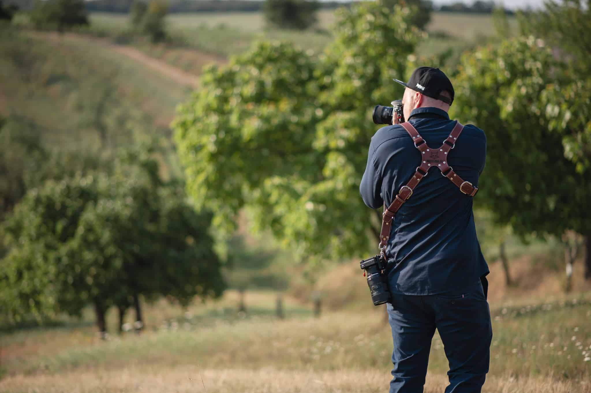
Shift Primary Colors is an easy way to accommodate the way your camera portrays colors. It lets you adjust photos’ starting colors to meet your needs before you even get started editing. And that’s not all. Shift Primary Colors is also a great tool for changing colors creatively—so come take a look at how it works and try it out for yourself.
The article is over 5 years old. The information in it may be outdated.
We are working on its update. In the meantime, you can read some more recent articles.
Shift Primary Colors is an easy way to accommodate the way your camera portrays colors. It lets you adjust photos’ starting colors to meet your needs before you even get started editing. And that’s not all. Shift Primary Colors is also a great tool for changing colors creatively—so come take a look at how it works and try it out for yourself.
The number one time you’ll be using the Develop module’s Shift Primary Colors feature is when you’re fine-tuning colors among photos taken with different cameras that have different sensors. They all see colors a bit differently.
Two of the best-known examples are shifting colors slightly towards purple for photos from Canon cameras, or slightly towards green for Nikon cameras. And Shift Primary Colors happens to be just the right tool for softening these effects, emphasizing them… or going your own way.
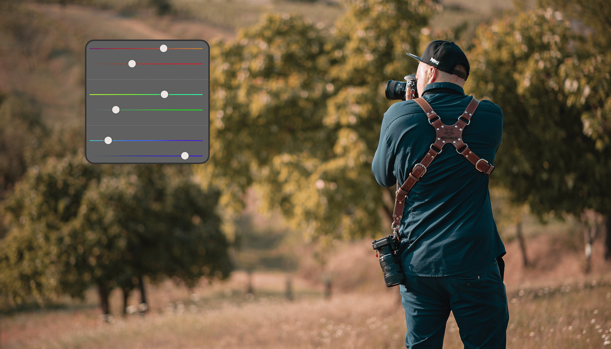
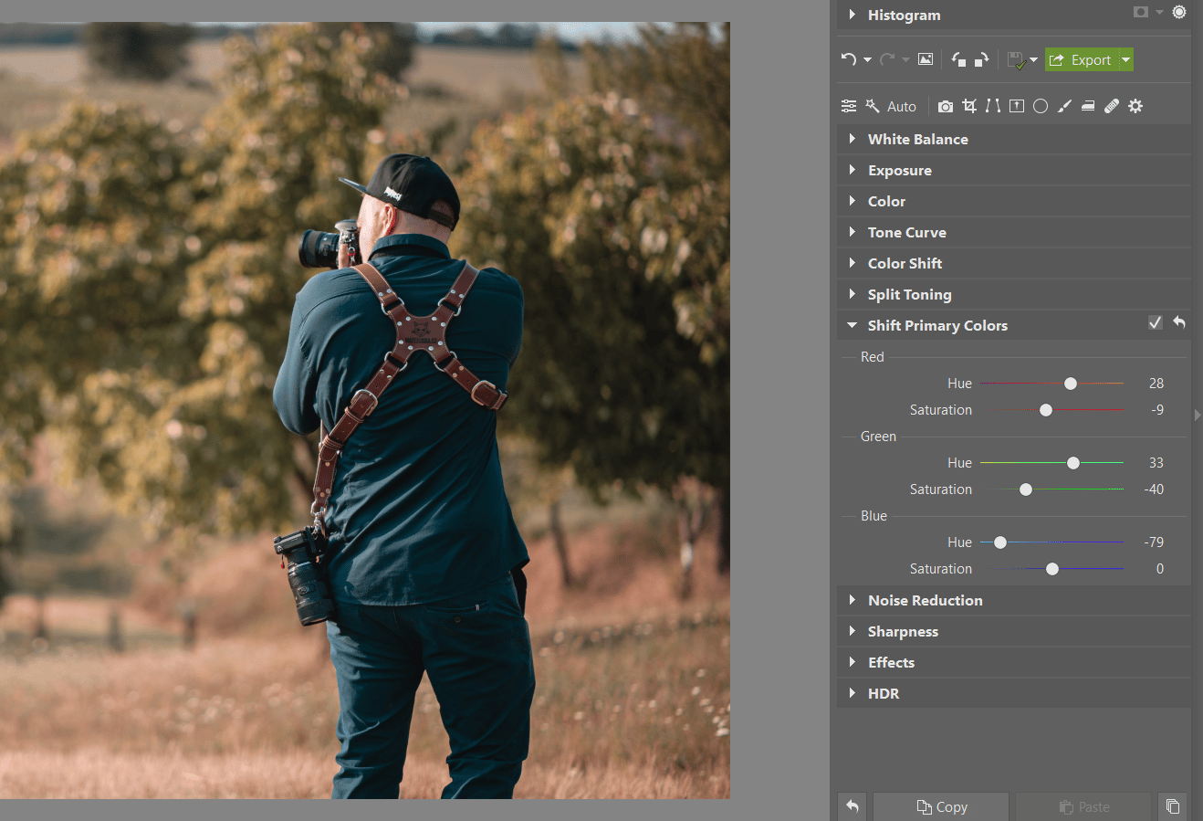
Six Simple Sliders
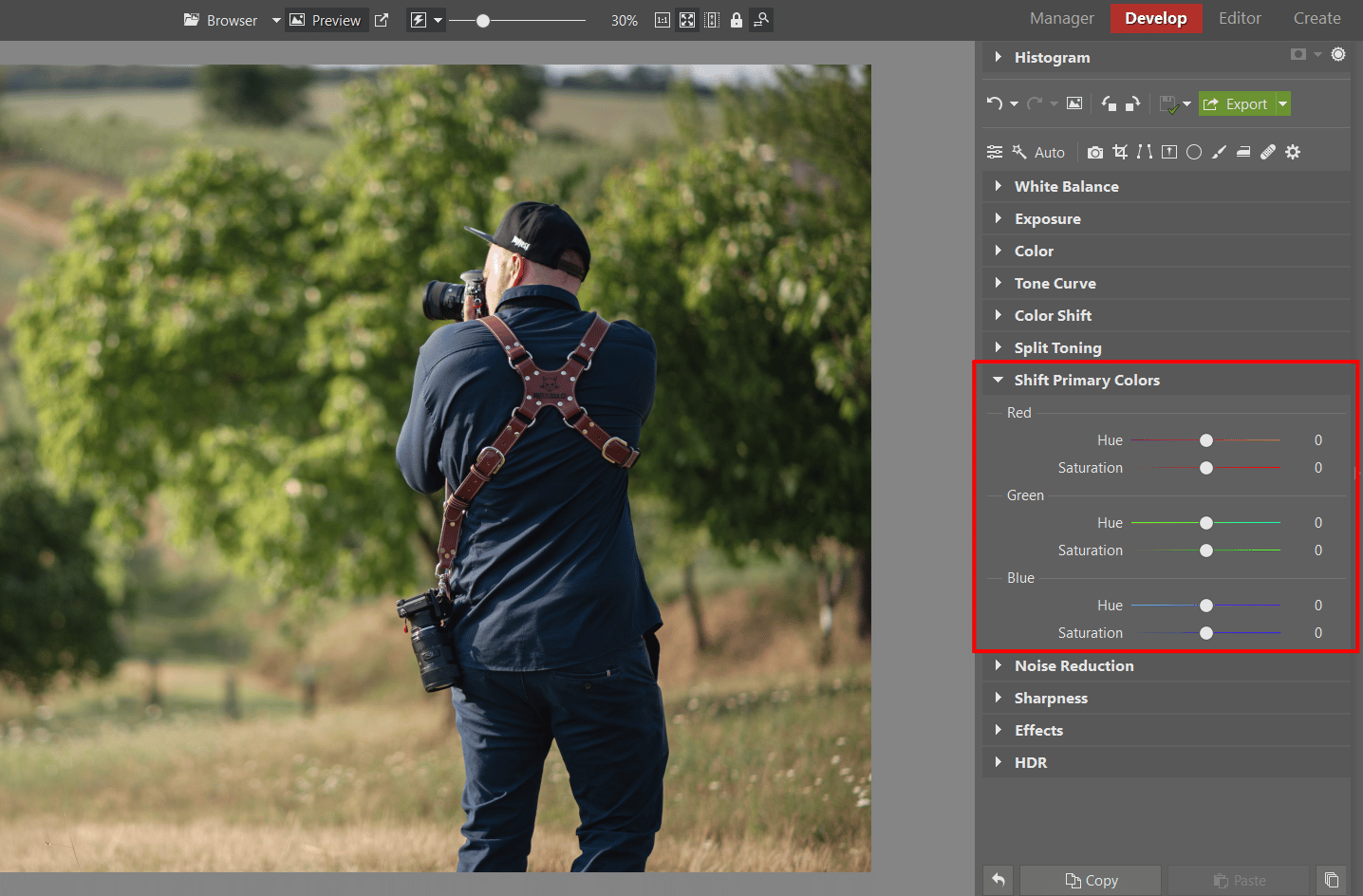
You’ll find the Shift Primary Colors controls Zoner Studio in the right panel of the Develop module. This tool is divided into three sections based on the three primary colors (RGB – Red, Green, Blue). For each of these color channels, you’ll find separate Hue and Saturation sliders.
The Shift Primary Colors controls are divided up along the primary colors themselves—Red/Green/Blue.
Untangling the Color Web
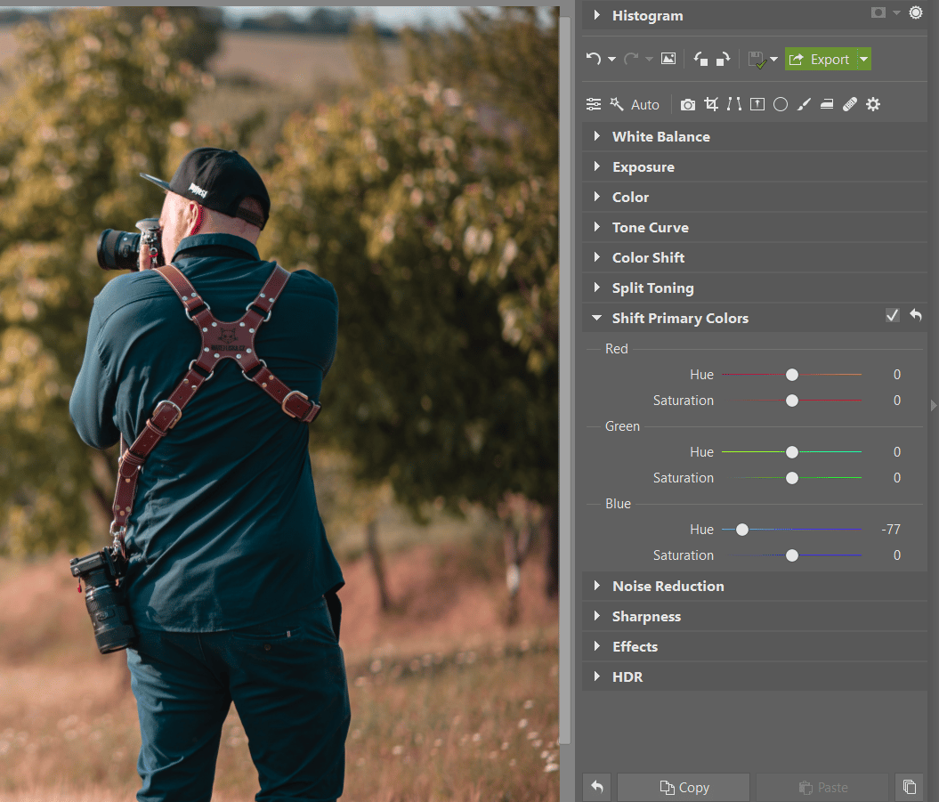
There’s not just one way to proceed here. But I’ve found that “starting from the end”—from blue—works well. The reason is simple: Red, which comes first, has the strongest effect on skin tones. So if you start with it and shift the sliders right or left, any people that are in the photo will look too yellow or blue, which can be a bit of a roadblock. That’s why I start from blue. And why I generally prefer negative values for blue.
Start by shifting the blue tones.
But as you can see, these blue edits affect skin tone a bit as well, pushing it towards purple. But this is easily fixed by pushing Red in the opposite direction, i.e. into the positive values.
Use the Red slider to adjust skin tones.
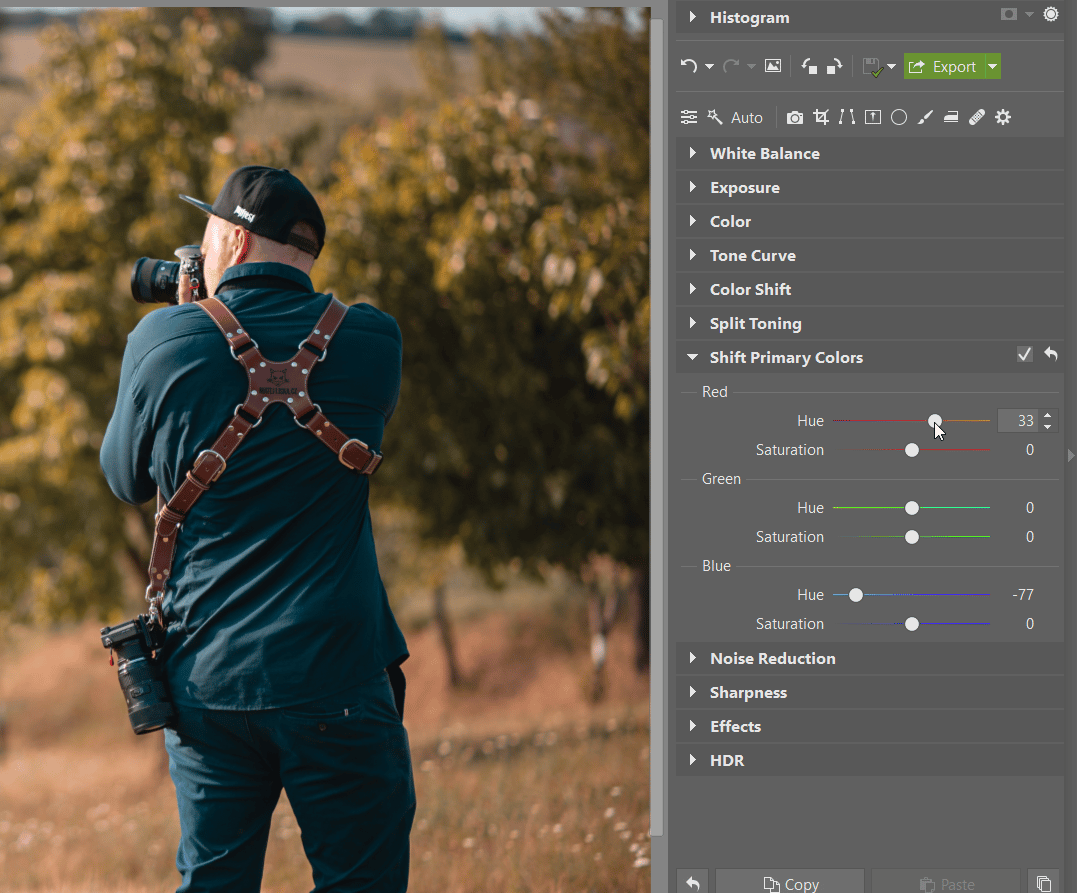
Wrap up by fine-tuning Green to suit the picture’s mood. Shifting colors can often make a photo feel garish, and that’s where the Saturation slider comes in. Which color(s) to desaturate is something that’s going to vary from photo to photo, so good old trial and error is the way to go here.
Wrap up by adjusting the Green channel and the individual colors’ saturation.
TIP: There’s an unwritten rule that says primary color shifts should numerically balance out to 0 if you want things to look natural. But nobody’s forcing you to follow it. It’s just a good thing to know about.
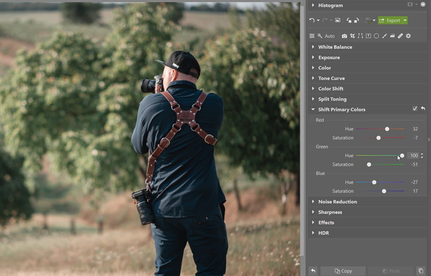
Another Shifting Example
Shifting red towards orange and blue towards sky-blue is an interesting combination—and there are others too. For example if you shift green to the right, you get “mint” greens in your photo. The possibilities here are broad indeed. And you can also combine Shift Primary Colors with the Color Shift and Split Toning tools to get precisely the colors you like.
You’ll definitely appreciate various edits to the Green channel as one “tool in your toolbox.”
A Sure Start for Your Own Style
If you’re not sure how to get started, download one of our Presets and take some inspiration—we’re constantly releasing new free presets for you to use. And you can adapt any of them you’d like to suit your creative needs.
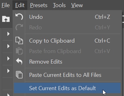
Then once you’ve got your color edits fine-tuned, save them as a preset of your own. That can save you a lot of time when you’re editing similar photos later on.
TIP: You can also save this setting as default in the Develop module.
Before & after for a black-and-white conversion preset
Start Your Creative Edits Today
Download Zoner Studio, try it free for 7 days, and see for yourself how you can get the maximum out of photos thanks to primary color shifting—and the program’s wealth of other color editing tools.
Receive our weekly newsletter to stay on top of the latest photography trends
Subscribe to receive the best learn.zoner.com has to offer
By confirming the subscription, you consent to the processing of your personal data for receiving newsletter. Learn more in our privacy policy.
I most love taking pictures of people. Weddings, portraits, graduation photos, balls... I am always in search of backlight, but I enjoy various types of lighting and mostly like to use shorter lenses. I love my Nikon, my guitar, and a kebab. You’ll find my photography on my website or on Facebook.

There are no comments yet.