Make Old Documents More Readable: A Scanner and Zoner Studio Will Help
The article is over 5 years old. The information in it may be outdated.
![]()
We are working on its update. In the meantime, you can read some more recent articles.
A reader of ours recently turned to us seeking advice. Her work duties revolve around scanning and manually transcribing old printed material and manuscripts, and there’s a certain problem she sometimes runs into. Time sometimes gnaws heavily at a document, leaving it largely unreadable, which makes the job of transcribing it more difficult. But you can make your work easier here just by reaching for Zoner Studio. It can help you to improve documents’ readability quickly and easily.
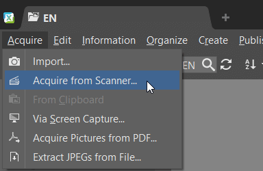
Zoner Studio can handle work with both traditional photos and scanned-in documents. You work with pictures from a scanner in the usual way and take advantage of the abilities in Develop and the Editor. Zoner Studio can also work with a scanner directly, making it very easy to acquire your source files.
Start by Planning Out Your Work
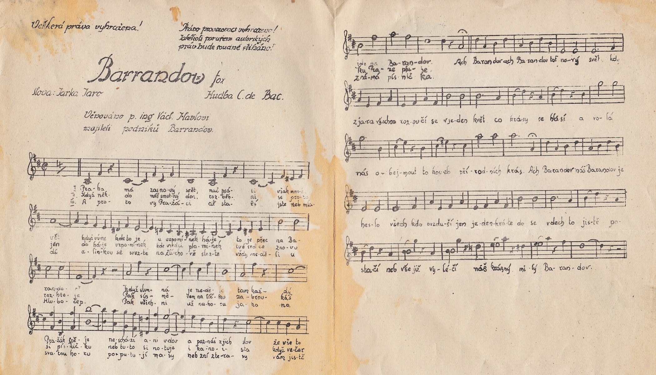
Before you start, first take a look at the scanned document and try saying to yourself what edits it needs. After my quick look, I determined that I’d be editing this document as follows:
- I’d get rid of the manuscript’s faded look using Dehaze,
- I’d highlight the black letters using Black Point,
- I’d increase the Contrast to separate the writing from the paper and improve the readability,
- To wrap up, I’d highlight the writing even more by increasingClarity.
I’d even go so far as to say that work with most old documents will be similar—the foundation for your work will almost always lie in highlighting dark writing and separating it from a light background. So let’s get started with the editing. We’ll be working in Develop non-destructively—without affecting the original file.
Get Rid of the Document’s Fading
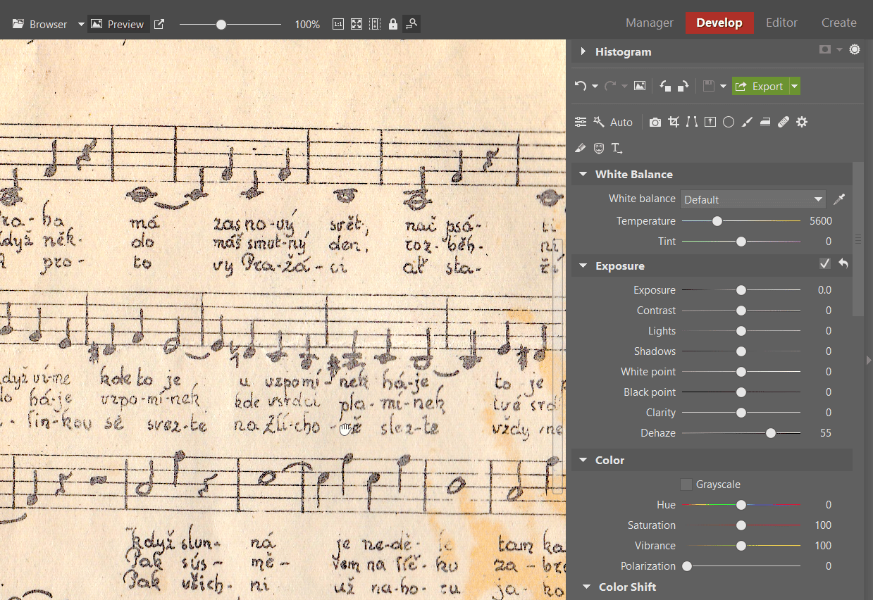
Ordinarily, you’ll most often use the Dehaze tool on nature photographs. As the name implies, you can use it to easily remove unwanted haze or change the intensity of a bird’s-eye perspective. But its uses are even broader, and here it will help us to roll back a manuscript’s fading.
I’ll be raising Dehaze here to a value of +55, because this value seems optimal to me. Adapt this tool’s intensity to your specific document, of course. Sometimes you’ll set it higher, sometimes lower. And at other times, meanwhile, you won’t need this tool at all.
Highlighting the Text Is Key
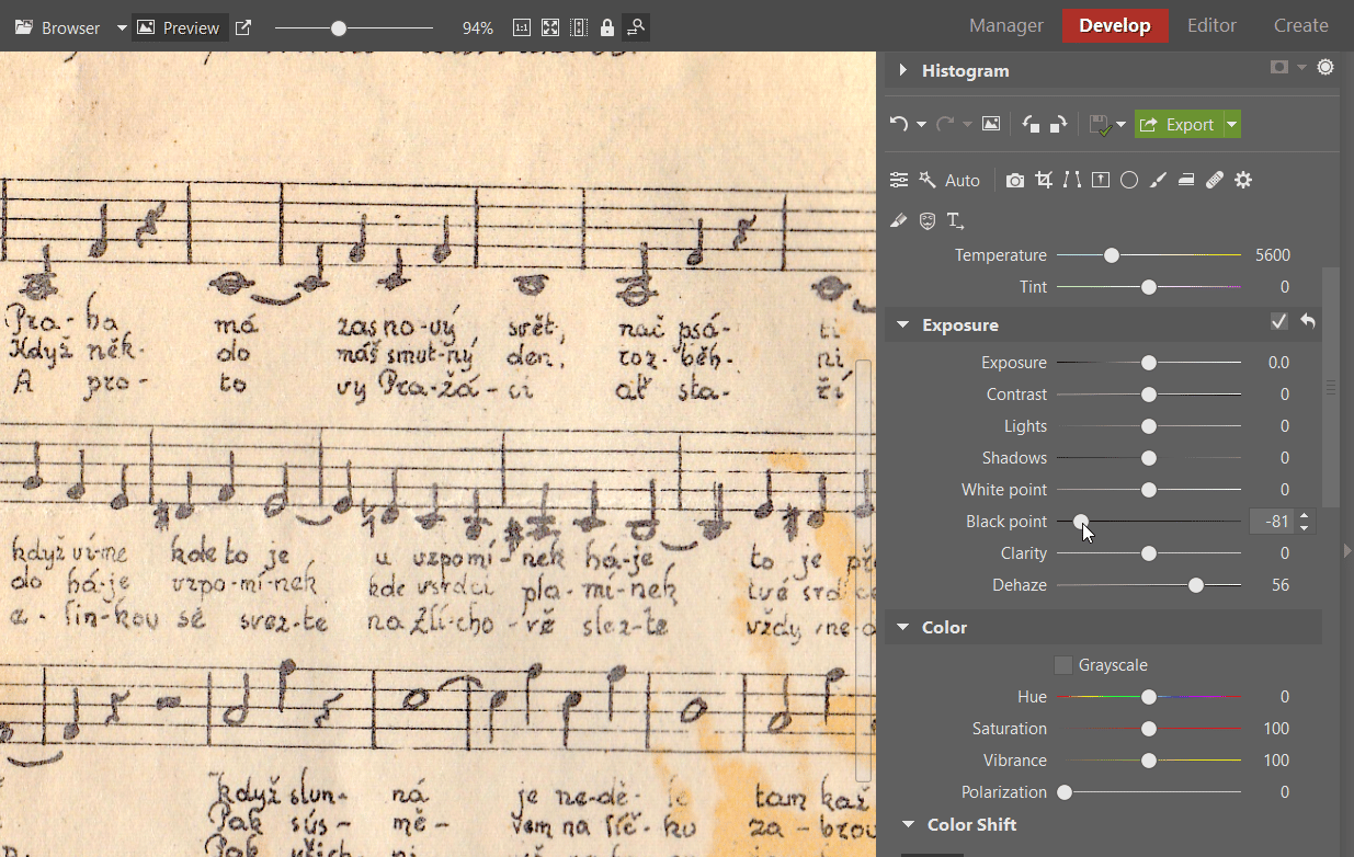
Next I work on highlighting the text. I’m working from a simple idea—the text is black, so I need to highlight black tones. The Black Point slider serves me for this superbly. I slide it to the left, and this time I don’t worry about going overboard. After all, I want to emphasize the text and darken it strongly. So I’ll be moving it down to -80.
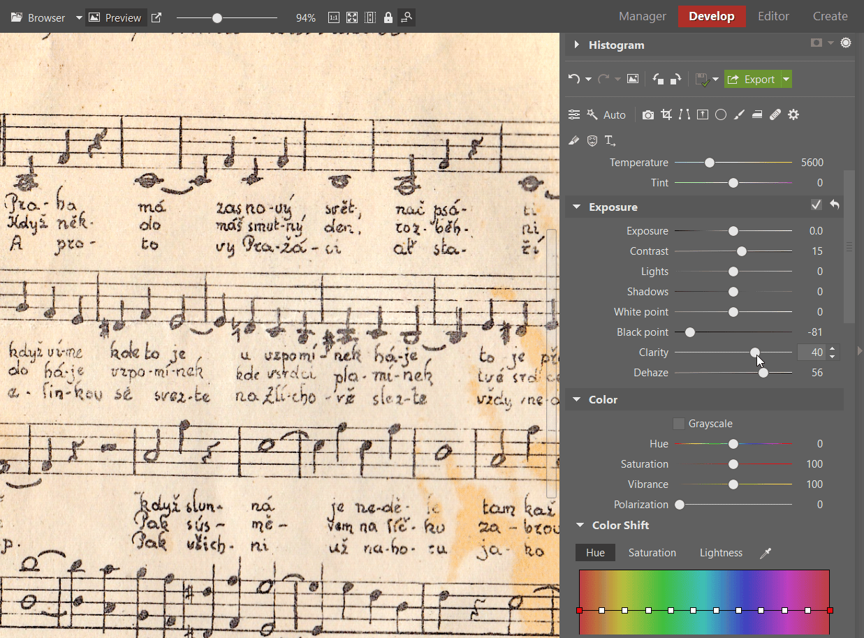
I continue by increasing the contrast. Through this I highlight the difference between the dark letters and the light background. This lets me separate the letters from the background even more, improving their readability. I’m more careful with the Contrast slider than I was with the Black Point. If I increase it too much, the contrast will get worse, not better. In this case I set a value of +15.

And this brings us to one of the last edits. The tool named Clarity can do a lot here. I’m not afraid of this slider, and so I move it up to +40. Clarity lets me emphasize the borders of the text and make it “pop out” more, leaving it more readable. Clarity really stands out as one of the most useful functions when editing old documents. Don’t miss out on it!
Wrap up by Editing the Colors
And we’re almost done. The text is much easier to read, and it’s very easy to see the difference relative to the original. But the edits have come at a cost—above all, the shifts to Contrast, the Black Point and Clarity have changed the color of the paper. This may not be desirable if you also want to preserve the document’s historical fidelity. So I’ll try to tame the colors a little to make the difference from the original less striking.
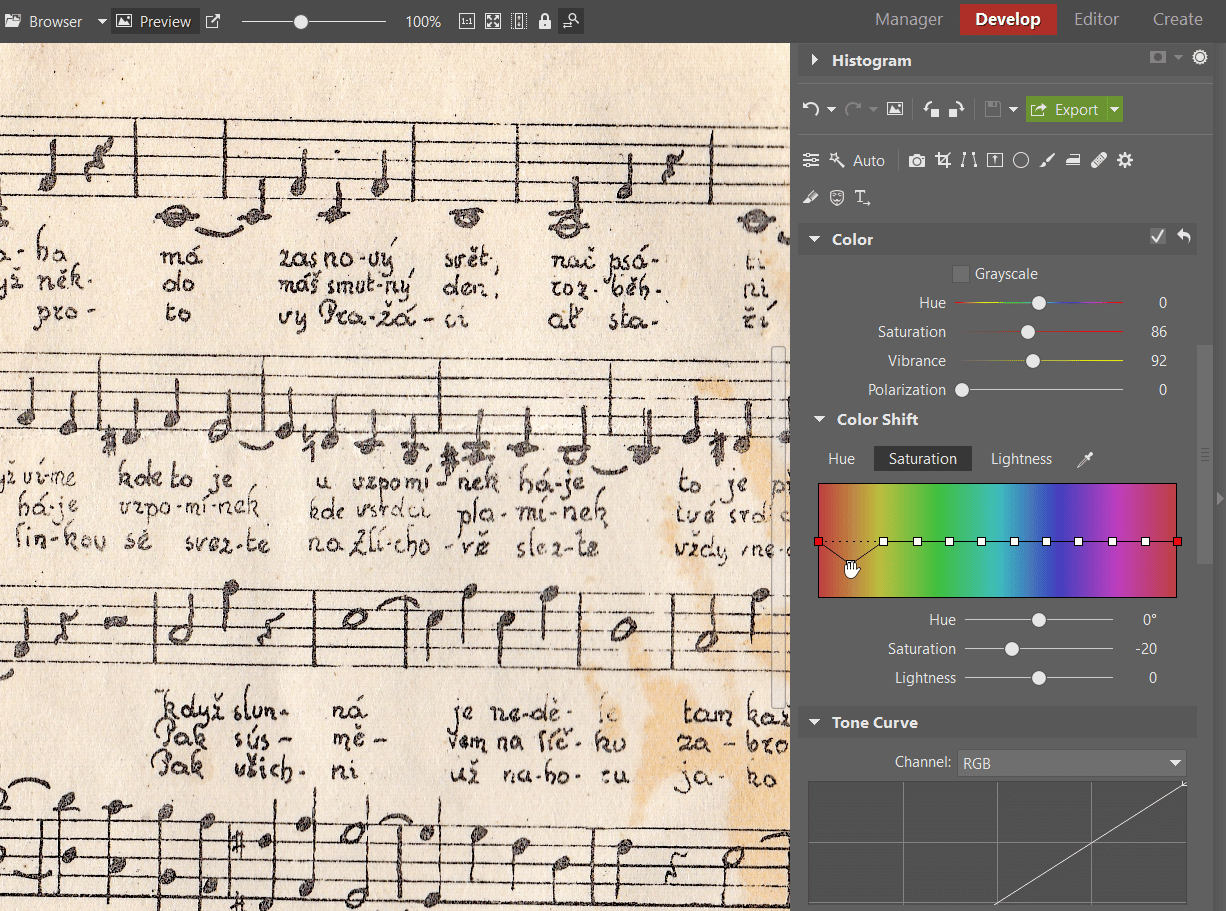
I move to the Color controls, where I slightly decrease the Saturation and Vibrance. Under Color Shift, I switch into the Saturation tab and dampen orange, since that’s the color that has been emphasized the most. Although I haven’t restored the original color, I’ve at least come close to it. It’s important to remember that global edits change the whole scan, not just the text. There’s no way to completely avoid color shifts. But my goal in this case is to increase readability, so I don’t have to worry about colors too much.
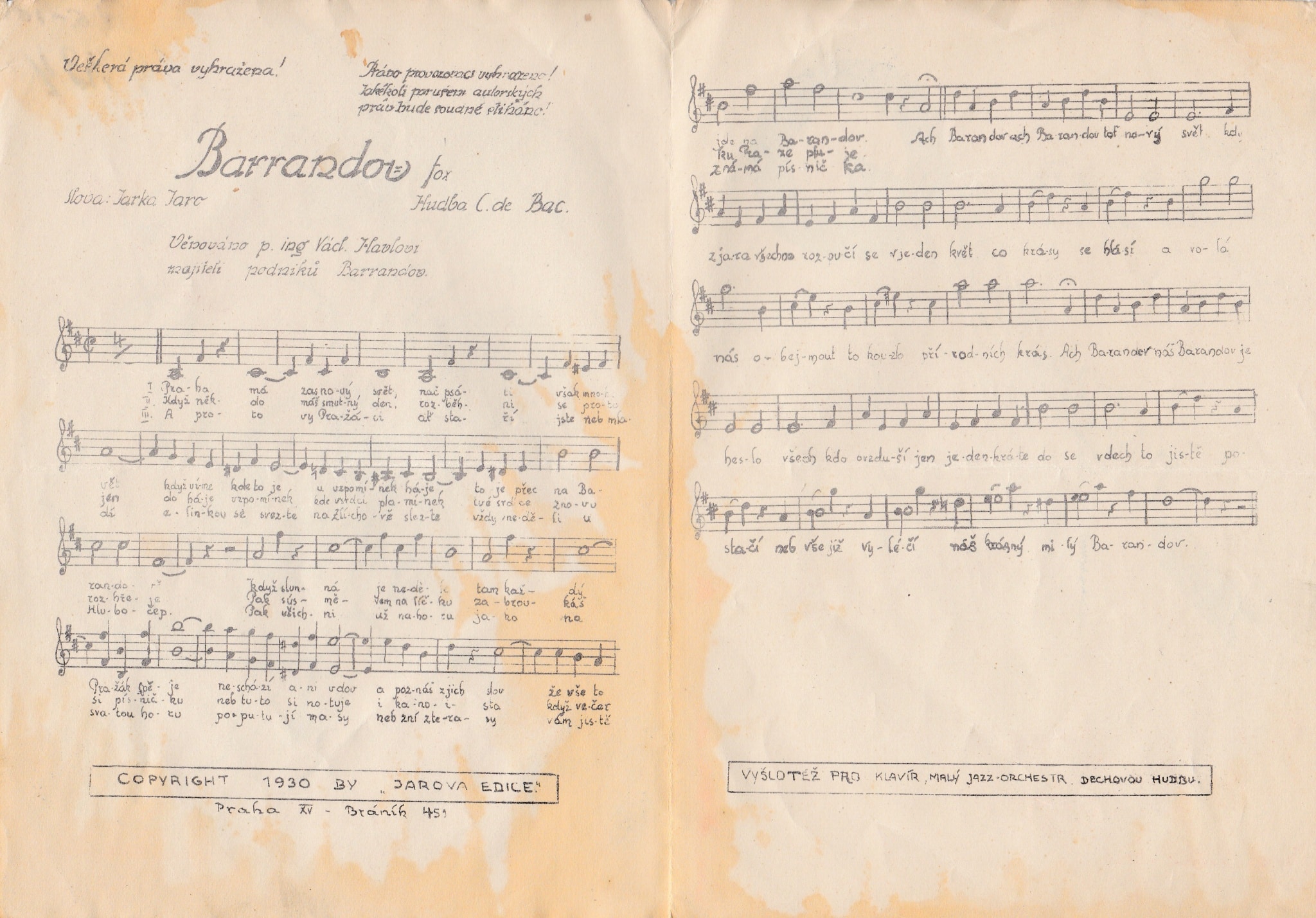
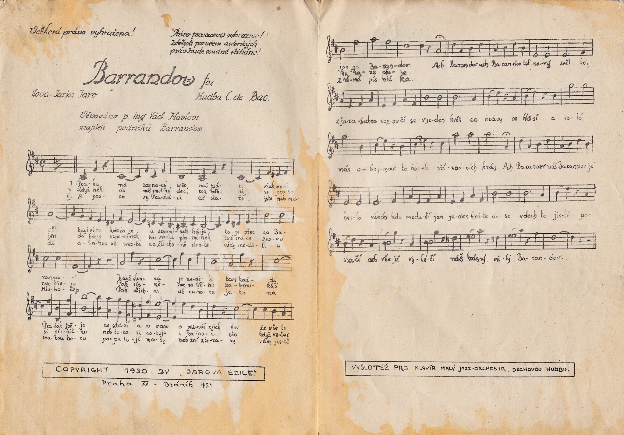
And here we have the result:

Conclusion
I spend most of my time editing photos, but as you can see, Zoner Studio has far broader uses than just that.
See for yourself how you can use it to easily save old documents even when they’ve started out barely readable. Download Zoner Studio, try it 7 days for free, and let us know how well your restoration work goes!

There are no comments yet.