Spring Portrait Editing I: The Develop Module
The article is over 5 years old. The information in it may be outdated.
![]()
We are working on its update. In the meantime, you can read some more recent articles.
I want to continue reading the article.
SIMILAR NEWER ARTICLES...…
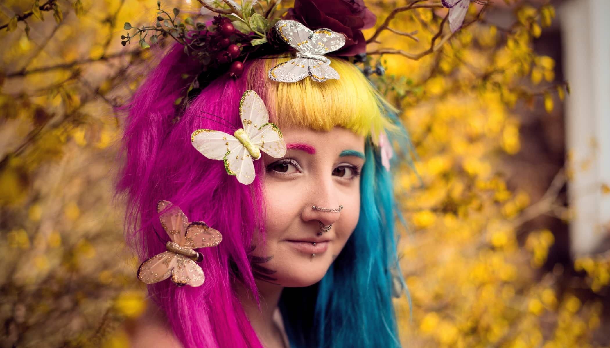
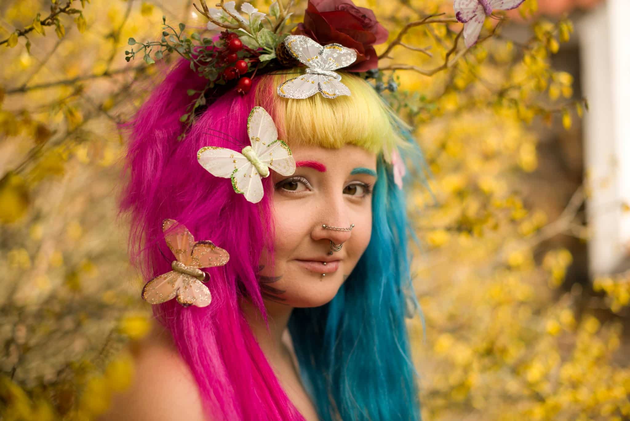
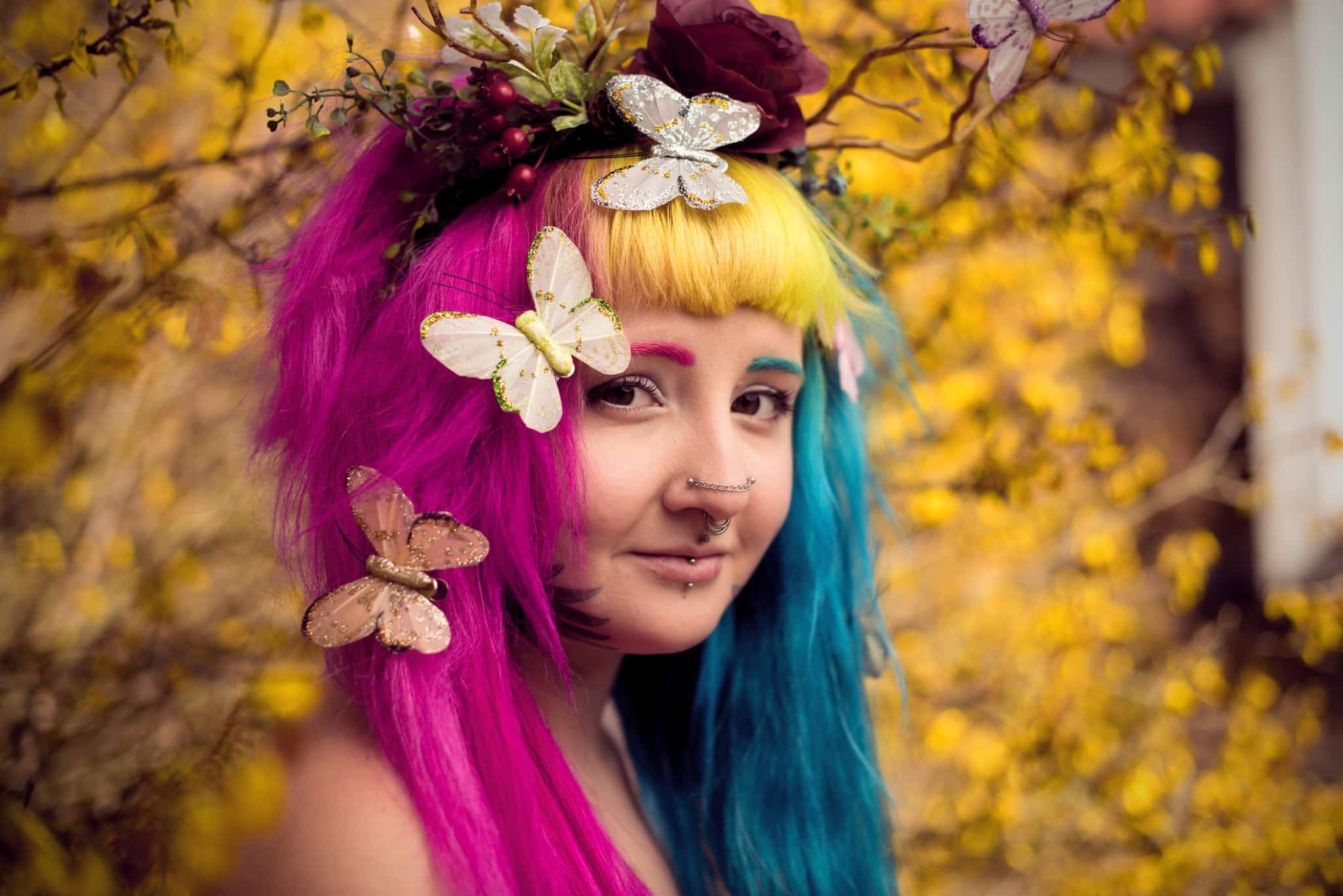
In this article, we’ll be taking a look at how to edit a colorful springtime portrait. We’ll walk you through all the steps of the process in the Develop module. We’ll mainly be looking at fine-tuning colors, work with skin tones, the Radial Filter (R), and mild exposure adjustments. We’ll also be giving you a few tips in the introduction on how to take a nice spring portrait. But if you’re not in the mood to take one, you can just download our RAW file and try out the whole editing process right away!
How to Take a Springtime Portrait
A good-looking springtime portrait can be taken nearly anywhere and with anyone. If you’ve got someone like your wife, sister, mom, or a friend around, all you need to do is to head out to your garden or behind your house and find your local spring flowers or a tree that’s in bloom.
So now you’ve got your model and your setting. But what should you do to make your portrait feel special? You can make hair decorations out of flowers, paper, cloth, or anything you might have around. Or take an old headband and add paper flowers to it… whatever gives the portrait a more colorful, springtime feel.
We recommend taking your picture with a wide-open aperture so that any bushes or trees behind your model fade away a bit due to the blurring. But watch out when focusing; it will be a bit more difficult than usual, and it’s likely that not everything will be in focus. We recommend sticking to an aperture between f/1.8 and f/2.2 if your lens allows it. Our test photo was taken at f/2.2, and you can tell how one eye ended up outside of the depth of field.
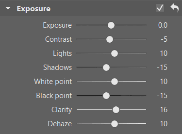
Adjustments using the Settings in the Exposure Group
A spring portrait should be bright, but be wary of overexposure. If on the other hand you take a dark picture, don’t hesitate to raise the Exposure setting in Zoner Studio. But since you’re using a wide-open aperture, your shot most likely will receive a lot of light. So your photo will be bright, and you’ll more likely be reducing the Contrast than increasing it. With the Lights and White Point sliders, you’ll likewise more likely be increasing than decreasing, and you’ll shift Dehaze a bit to the right.
It can be good to reduce the Clarity a bit, but it strongly depends on the character of your model. With the model in our picture, it’s actually good to increase it a little, because she’s striking and sharp in nature. But truly just a little, because the foundation of a fresh spring portrait like this is a gentle look.
If you decide to reduce the Clarity, we recommend that you don’t bring it too far down; you want to preserve the model’s skin texture. You definitely don’t want to turn them into a wax sculpture. You can decrease the Shadows and Black Point settings a bit to keep the flood of brightness from producing a flat and foggy face.
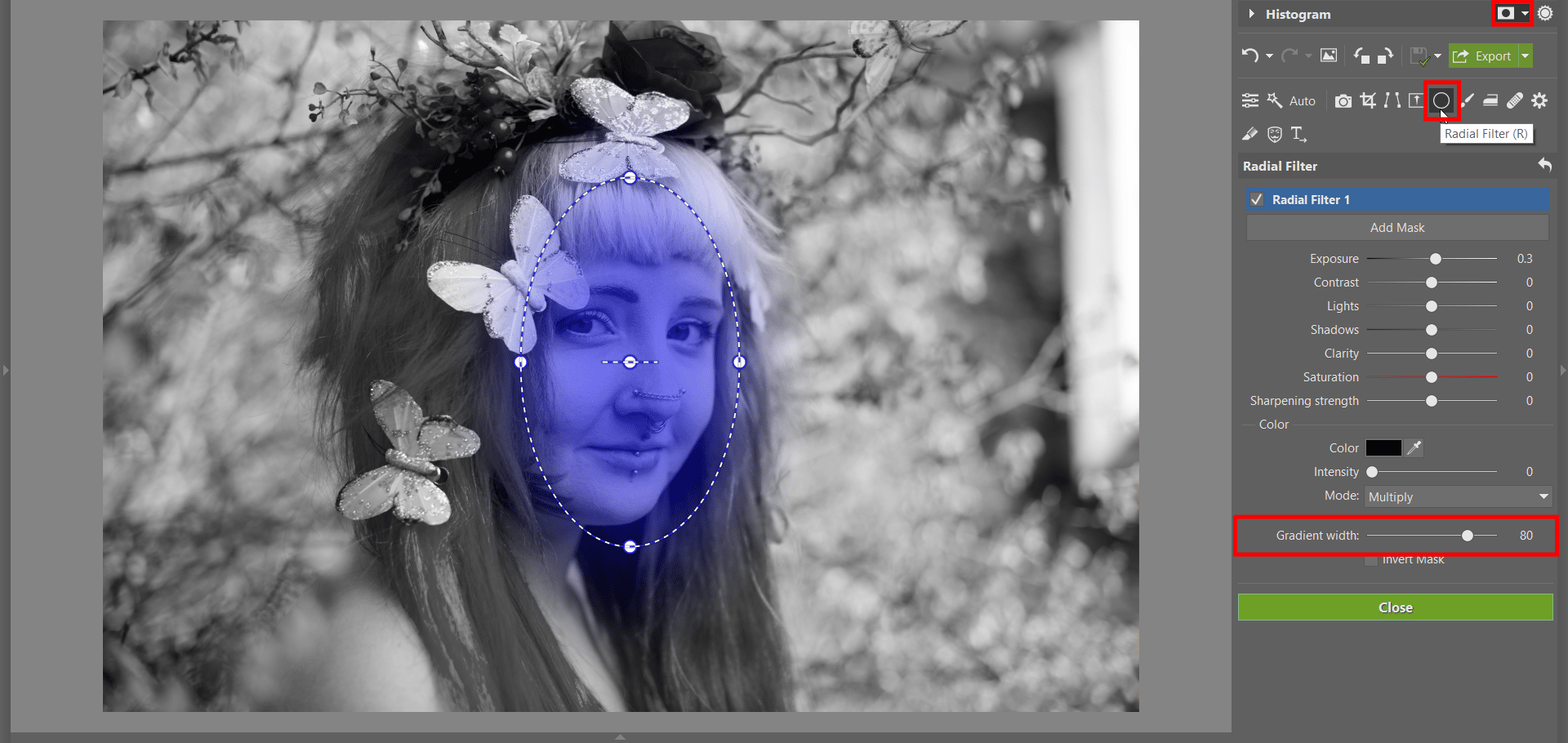
Add a Radial Filter
Apply a Radial Filter (R) to the model’s face to help it pop out of the picture, look brighter, and draw more attention. Apply the filter by left-clicking and dragging to cover the area where you want the filter to be. To easily see where you’ve applied the filter, turn on the Show Mask option on the right above the Histogram. Add a couple of points to Exposure and then increase the Gradient Width so that the brightened area will naturally blend with its surroundings.
Fine-tune the Colors
Don’t be afraid to add a bit of Saturation or Vibrance in the Color section if the picture fundamentally lacks color. Let all of the colors that you worked into the picture shine through. Our example picture was rich in colors straight out of the camera, mainly because of the model’s hair.
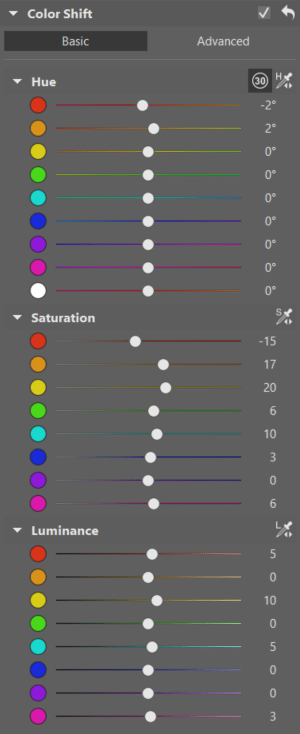
Moving on to the Color Shift controls, you’ll find three categories:
- Hue
- Saturation
- Lightness
You’ll want to drag the Shadows values up into the positive values; a downwards shift here is more something for autumn, when colors are darker, browner, and warmer. But springtime is green, fresh, and bright.
Add Saturation mainly to flowers and greenery. If you have green tones in your picture, you want them to be saturated and fresh.
As for flowers, meanwhile, you want their colors to be striking, because flowers are the foundation of spring! But make sure that your saturation increases don’t also affect the model’s face. They shouldn’t turn pink or orange.
And you can use Lightness if it feels like some color is unnecessarily dark.
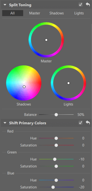
Now Fine-tune the Colors Too
Split Toning changes a picture heavily, so you should be careful with it, especially in photos that have a lot of base colors. For our sample photograph, we can slightly shift the Shadows setting; if you’d like to experiment, feel free to work with the other two circles (Lights and Master) as well. But for a picture with colors as varied as they are in this one, we’ll lean towards caution. There’s no law saying you have to use every feature in Zoner Studio! Especially for photos as bold as this one, we don’t want to overdo anything.
Shift Primary Colors is yet another tool with a powerful effect, so we recommend that you only turn to it if you’re still not satisfied with the results you see before you. If you get the feeling that your overall intensive edits have produced a result that’s too colorful and striking, you can draw one of the color channels downwards.
If that still isn’t enough, add Saturation to green or red, or decrease the green channel. Every photo is different, so your own garden portrait may require different color settings, but the basic idea is clear: colors, lightness, and freshness!
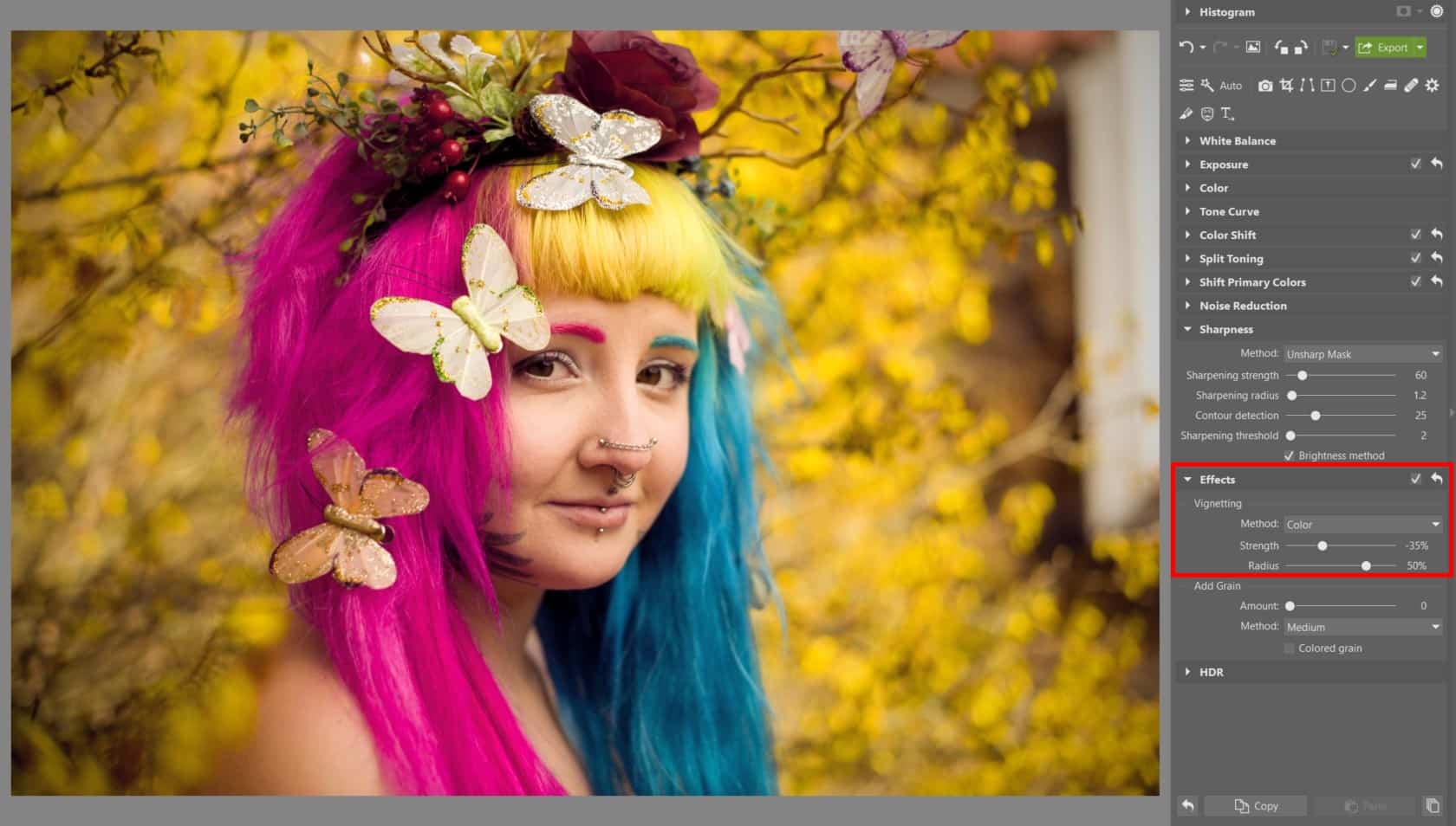
A Few Final Edits
We recommend two more things at the end: Vignetting and ironing the model’s skin a bit. Vignetting will help even further to make your model’s face “pop.” It adds to the intensity of the radial filter you created… but we definitely recommend applying color-based vignetting rather than exposure-based. And keeping it weak. An unnatural gradient from completely dark corners into a bright middle wouldn’t look very good. We recommend a maximum strength of 35.
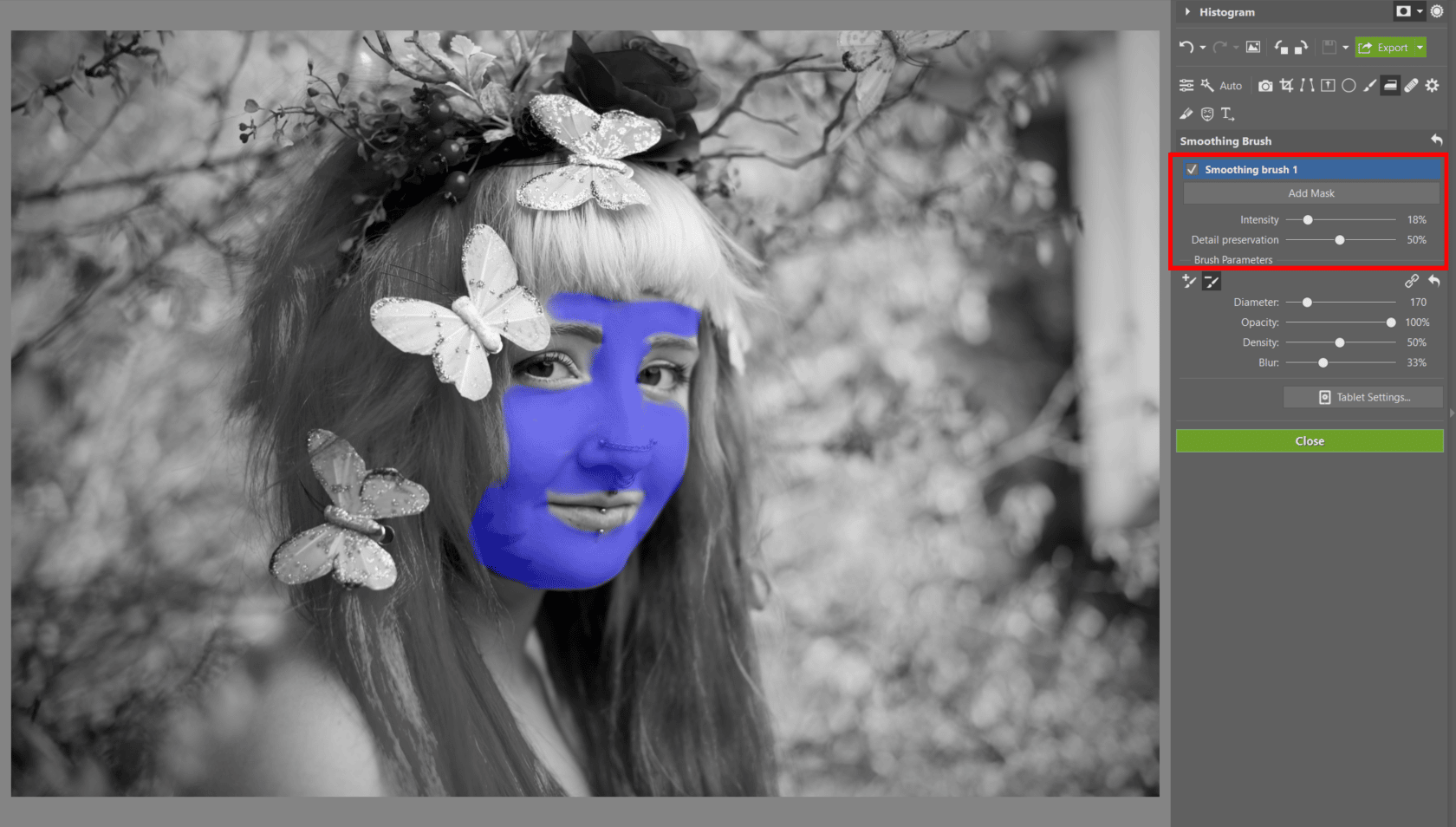
And the second thing is one that you have to really use in moderation, and that’s the Smoothing Brush (U), which is an excellent aid in portrait retouching. But keep the skin’s texture; don’t let the model end up looking more like a wax sculpture than a person. We don’t recommend using the Smoothing Brush at all if you’ve reduced Clarity in the Exposure settings. Only if you’ve increased it. Otherwise your results could look excessive.
In Closing
Spring photos are a pleasant change of pace after the long, dark, and color-starved winter. And it’s also a very colorful phase before the golden summer full of sunsets and yellow wheat. The grass is green, the flowers are vibrant, and the people are full of energy, and all of this can be marvelously combined into a single photo. And now you’ll be better at editing it all too—now that you know the ropes!
But the Develop module isn’t everything! You can look forward to the second part of this article soon. We’ll be showing you how to fine-tune a photo and make more advanced edits in the Editor module. Got some nice spring portraits already? Show them off to us.
There are no comments yet.