sRGB, ProPhoto RGB and More—Do You Know Your Color Spaces?
The article is over 5 years old. The information in it may be outdated.
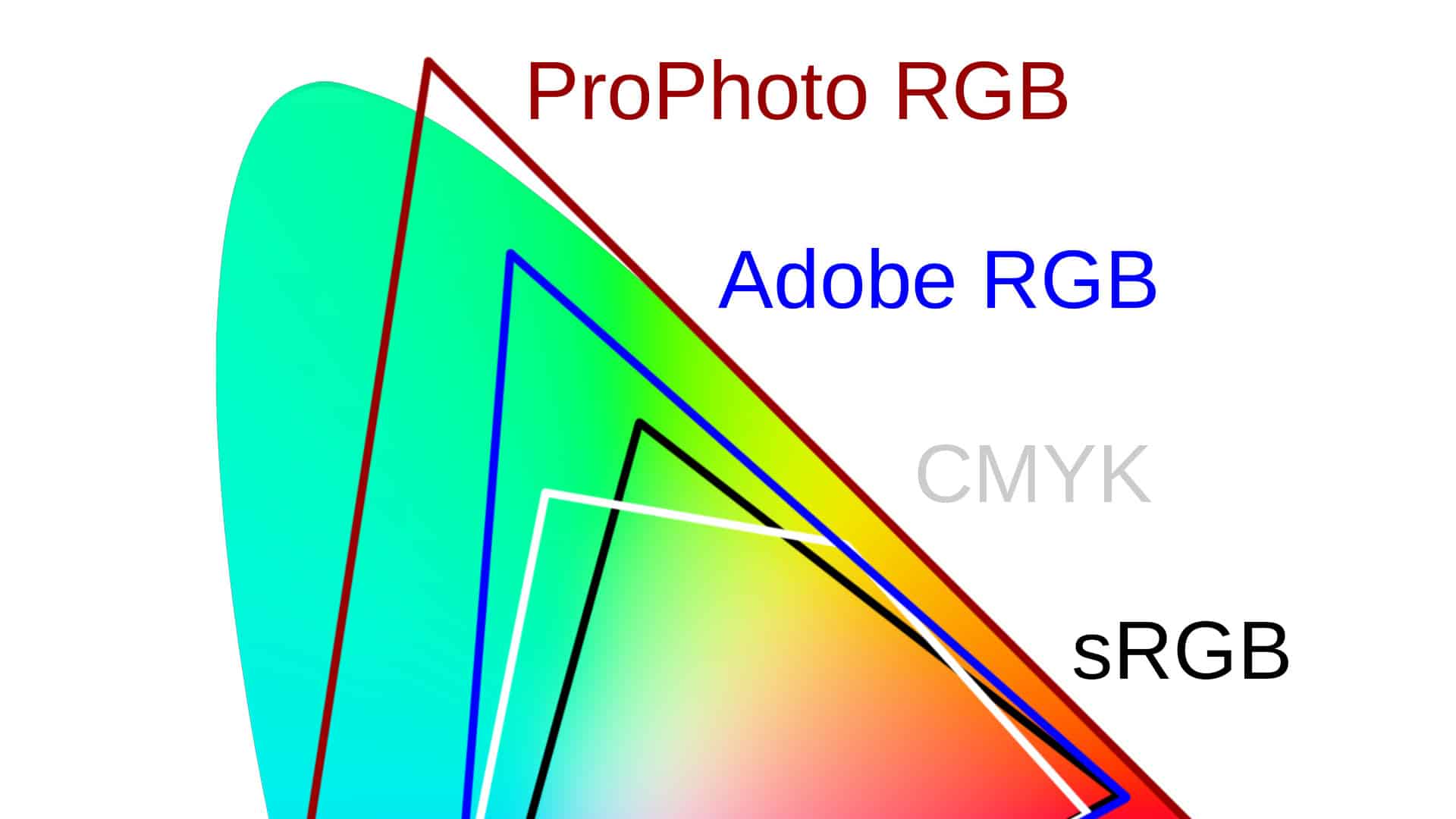
![]()
We are working on its update. In the meantime, you can read some more recent articles.
Color spaces are fundamental when you want to talk about correct and correctly displayed colors and about how to get the most out of them. This relates to both displaying pictures on various displays and printing your pictures after editing. Take a look with us at the chromatic building blocks that affect the rest of your work with photos.
You may have run into the problem where the photos on your computer look different at your friend’s place or on your phone, and completely different when you print them. There is a wide range of possible causes for this, and not all of them can be resolved, but some can, so it pays to know the foundations of how different devices work with colors.

What Are Color Spaces?
A color space in general is a set of colors that has been defined in some way. Typically they are colors that a given device is able to display or print. But there are also theoretical color spaces that are not tied to any particular device and serve only for helping us all communicate. There are a number of color spaces, from the well-known RGB and Adobe RGB through CMK all the way to e.g. CIE XYZ and CIE L*a*b*.
The set of all the colors that can be found in a given color space is called its gamut. If a color is outside of this range and thus for example cannot be displayed or printed, we say it is out of gamut.
All the Colors Visible to Humans
To be able to show the differences between individual spaces, we need to have an easy-to-understand set of all colors available, or more precisely, it’s enough to limit ourselves to all the colors visible to an average person.
The “CIE XYZ color space” was created for these purposes in 1931. The components here are not the traditional red, green, and blue, but rather the virtual numbers X-Y-Z. The details need not interest us, but still: the Z component determines brightness, and so if it is left out (and the other coordinates are recalculated a bit into lower-case x and y), we get a 2D space in which one can indicate every shade of color. Humans are not able to see all of the colors on this plane, so the result is the following restricted color plane with a characteristic shape.

The Standard Color Space
The shape of the color “horseshoe” is precise, but the colors inside are indicated only approximately. This is because a monitor cannot even come close to describing all of the colors a person can see. Also, each individual monitor is configured differently. Imagine for example three monitors with each one using a slightly different red, green, and blue and colors mixed from them. This thus produces three different sets of available colors.

If a program sends these monitors a request to display red #255, i.e. a maximally saturated red, that corresponds to the right corner of the triangles in the graph, but it’s a different color each time.
This is why the sRGB – standard RGB color space, in which all three primary colors are defined precisely, was created.

Unfortunately monitors still vary individually, but manufacturers at least know what standard they should try to approach, and so deviations are perhaps smaller than in the past. Also, for some monitors you can now choose in a menu whether you want to use a more precise sRGB standard or for example more vibrant cinematic colors, etc. The sRGB standard is typical for all photographs and pictures on the web, if not specified otherwise.
If you’d like to achieve high color precision on your own monitor, the only way to do so is to calibrate it using a device called a calibration probe. Without it, programs have no chance of knowing the display’s real behavior and will display whatever red they have available instead of a precisely defined red. And the other colors are also distorted accordingly.
The Printing Problem
Printers produce colors in a completely different way—instead of lighting up an otherwise-black monitor bit by bit, they “dirty up” white paper. So their color space—CMYK—looks completely different from sRGB as well.

Printers cannot print certain colors that we’ve previously seen on a monitor, and software has to deal with this fact in one way or another.
Converting from One Color Space to Another
If the target color space contains all of the source space, then there’s no problem. While it’s true that individual pixels will have different color numbers, the information will remain preserved (more or less).
The problem comes, just like in the previous section, when certain colors can’t be easily converted and are out of gamut for the output device. Sometimes we can choose our conversion algorithm, and at those times, there are four available possibilities:
Relative Colometric – one of the two algorithms that are best for photos. The colors that the target space can handle are converted unchanged. Any color that is out of gamut is cropped to the nearest color. However, with this method, originally quite different out-of-gamut colors may be all converted into one seamless blob of color, so this method is only useful for photos where there’s a conversion problem in a small part only.
Perceptual – the other algorithm that can be used for photos. The sizes of both color spaces are compared, and all of the colors are shifted (not just the ones that are out of gamut) to make the original fit into the resulting space. You can think of it as dividing everything by two. This method preserves the relationships among colors, but colors may be somewhat less vibrant than in the previous case.
Absolute colometric – similarto the relative colometric conversion, but the so-called “white point” is shifted as well. This is useful when, for example, you’re using white paper on a printer to test how printing onto yellow paper would look, but for us photographers it’s rarely useful.
Saturation – Colors outside of the gamut are converted to their more saturated counterparts without regard to their color fidelity. This is great when you’re printing graphs for a meeting, but far less so for your pampered pictures.
Larger RGB Spaces
What if we were to describe a picture in a larger space, one containing all printable colors? This kind of thinking led to the creation of broader RGB profiles such as Adobe RGB, ProPhoto RGB, DCI-P3 (for movies), and many more.

As you can see, Adobe RGB contains nearly the entire CMYK space, and ProPhoto contains many more colors even beyond that.
Cameras take pictures in color spaces that are larger than sRGB, and if you are using the RAW format, you can access these colors. JPEG images are generally only delivered sRGB colors, even though on certain cameras you can also choose to save to Adobe RGB via a menu option.
Monitors and Multiple Colors
Monitors with support roughly equaling sRGB are the most common ones at the moment. If you use one of these to edit a photo stored in a larger color space such as e.g. Adobe RGB, the editing software has all of the information and performs the right operations, but at every step, you yourself only see them as they look after conversion to sRGB. Due to this, you can’t see precisely what you’re editing.
However, monitors with support for a larger color spectrum are showing up more and more often; on these, you really are working with something close to the Adobe RGB space, and you see those colors on the screen. Starting in 2016, the display of the iPhone 7 began displaying a similar color space as well.
Arguments For and Against Larger Color Spaces
With a larger color content, you’ll likely come closer to the target with any prints you might go on to make.
You can also work with saturated colors that your camera has captured, and even though you may not be able to use them as such in your final picture, you have them under control and can decide what to do with them. If, for example, you need to convert an unprintable saturated green to a less saturated green or to a color that is similarly saturated but more towards blue.
On the other hand, if the web is your target, with 99% likelihood you’ll still need to export your result to the sRGB color space. If you were to publish an image in a different color space, you still can’t be certain even today that it will be displayed to other people in their browsers correctly at all. In short, their browsers can’t understand certain color spaces.
So it often makes sense to work with sRGB colors directly, so that you can see the precise result.
For illustration, the image below shows three situations: On the left, there’s a saturated source image in ProPhoto RGB. In the middle is the same image after conversion to sRGB, leading to an expectable suppression of colors. The third variant is displayed if the browser (be that a web browser or an image browser) receives a picture with a ProPhoto RGB profile, ignores it entirely, and uses the color numbers as if the picture were in sRGB. The result: very strongly desaturated colors, and it’s basically a catastrophe.

Closing Recommendations
The most direct path is to “play it safe” and use the sRGB color space. You don’t have to worry about your outputs, and everything you send to your friends on the web will be displayed correctly.
But if you like to play a bit, and ideally you have a monitor with support for the Adobe RGB space, you can try processing photos within it. Your colors will come alive wonderfully, and it’s a joy to work with them. But you have to keep in mind that when exporting to the web, everything is converted to sRGB, and other people will see a slightly different result.
There are no comments yet.