What the Works of Great Painters Can Teach You About Photography
We all often examine the work of other photographers, professionals, and the best in our field so as to capture and absorb at least a part of their skill, so we can apply it later in our own pictures. Let’s try extending our study of the great works one step farther outwards, to painting. What can painters’ great works offer photographers?
150 years ago, when photography began slowly working its way into the realm of art that had previously belonged to painting alone, it caused quite a few debates on its status. People discussed whether or not photography can be considered as art, and how, in fact, to grasp it. Even just summarizing these discussions would make for its own article. But we can at least state in retrospect that photography and painting influenced each other strongly, and a photographer’s work is in many ways not all that different from a painter’s work.
While a painter gradually places color on the canvas to shape their vision into a final picture, a photographer must either wait for every circumstance to converge in a way that realizes their vision, or suitably stage and light that vision.
But what they have in common are certain visual principles that developed hundreds of years ago and in many ways are still valid and functional today. Both photographers and painters work with nothing a mere two-dimensional image, and their goal is to give it life—the illusion of motion and spatial depth. How can they do it? There’s no better way to learn than via works that have already proven themselves for many years—painters’ masterworks.
How to Emphasize the Subject
From its very beginnings, painting has lavished attention onto composition. In Egyptian frescoes, the most important figures were painted the largest; later, work with verticals, horizontals, and diagonals developed fully. This work hold the most interest for photographers. In the real world there are only points and curves; true straight lines are hard to find (outside of architecture). But painters made heavy use of the abstraction of these lines so as to deliberately lead the viewer’s eye along a picture to its most important part.
When you look at Raphael’s picture of the nymph Galatea riding the waves on a sea chariot drawn by two dolphins, you will soon easily see the three main lines that define the core of the picture. The first leads along the angel’s arrow on the left, and is extended by the tack of the dolphins and the tilt of the nymph’s head. The second leads along the right angel’s arrow and continues along the axes of the bodies of the nymph and of the other figures below her. The third is formed by the line of her scarf and her hair flowing together in the wind. And the main subject of our interest lies at the intersection of these three.
Also note how Raphael further emphasized Galatea via his balance of composition—the group of figures on the right has its counterpart on the left. The boy in the lower part of the picture swimming alongside the craft has a counterweight in the little angel in the upper part of the picture; also, their bodies are oriented in opposite directions. These directional contrasts also aid the illusion of motion. The gaze of the nymph and the direction of her flowing hair and scarf oppose the direction formed by the dolphins’ harness. Raphael was very admired for his ability to compose freely moving figures. And rightly so—in this image, you can feel the wind blowing Galatea along the waves.

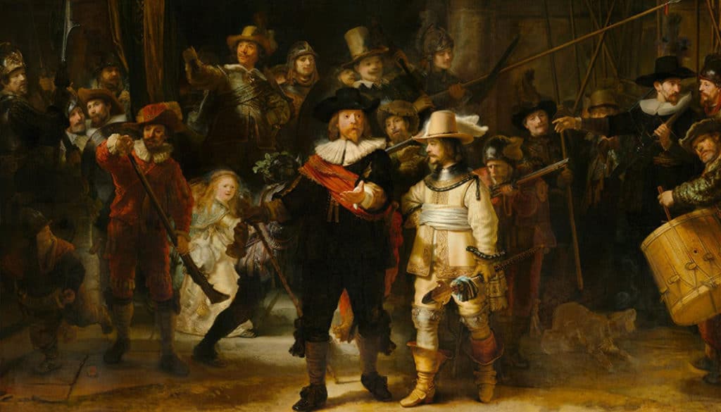
You can often find similar methods of leading a viewer’s eye. Just take a look for example at the following picture by Caravaggio: the lines of the gazes aim directly at Christ’s wounds, which are the picture’s central topic.

Disciplining Space
Painters also utilized diagonals to organize space. The Death of Sardanapalus by Eugène Delacroix could easily feel very chaotic with its masses of bodies, figures, substances, and objects. But Delacroix had Sardanapalus lie on a bright red cloth. That cloth marks out two diagonal lines that ease one’s orientation in the picture.

But painters didn’t just work with straight lines. They also organized space with the help of curves, which can lead the human eye equally reliably. Rubens, for example, composed the whole procession leading to the Virgin Mary as a single arc, supported by the figures’ gestures and the tilts of their heads. This catches the viewer’s attention and leaves them to follow the procession from the lower part of the picture all the way to Mary.

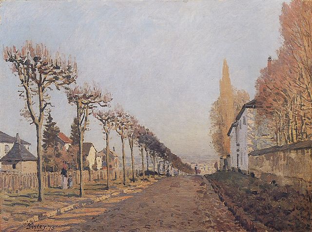
Work with lines also made its way into landscape painting, where it mainly served to create the impression of space and perspective. In this picture by impressionist Alfred Sisley, follow the lines formed by the crowns of trees, the roofs of houses, and the edges of the street, which come together in the lower third of the picture and leave in you the impression of a path continuing out somewhere past the hill into the distance.
Contrast of Bright and Dark Surfaces
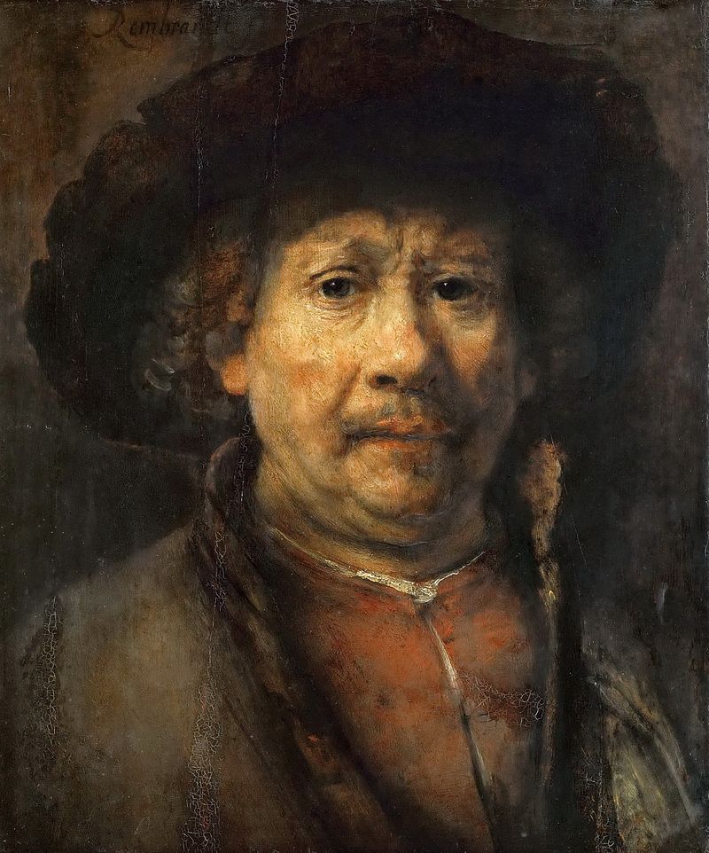
One other technique frequently used by painters is to alternate light and dark surfaces. By darkening of the whole environment, you make a picture’s subject in its center stand out. (The opposite also works too of course: a dark object against a light background has the same effect.) Often a certain schematicness and simplification of the background contributes to this. The parallel with the use of depth of focus in photography is obvious. Rembrandt used this very effectively in the following picture. The dark tones in the background sharply contrast with the bright shining figure in the foreground and thus give it a much stronger accent and dramatic feeling.
Combining light and dark areas also helps to form a rhythm. Notice here how Caspar David Friedrich uses it when he intertwines light fog and dark hilltops along almost the entire surface of his painting. The rhythm is fully uninterrupted, leaving the hilltops to stand out beautifully.

Masters of Light
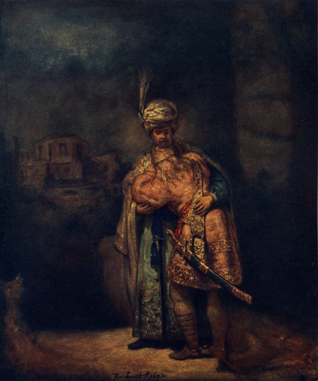
Mastering light—its direction, intensity, and focus—was among the powerful painting techniques that were especially part of the craft’s collective consciousness among the Dutch masters of the 17th century. It was, however, also used artfully by others, and still finds application today. The most important figure in the picture receives the most light, while the less important ones stay less illuminated, as you can see in this painting by Velázquéz.

We can see a similar approach in the next picture, by Adriaen van Ostade. The main events in the foreground are illuminated, while the secondary events in the background are shadowed and unsaturated. This also gives the picture a feeling of space.

The true master of work with light in a picture was Rembrandt. (We’ve already seen one of his works above.) And so there’s even a studio lighting effect named after him, where part of a subject’s face is covered in shadow, and their eye is only lighted via a small triangular space below it. This kind of lighting gives a portrait a slight tinge of drama.
But that’s not all; the time of the Dutch Masters was also when the beauty of natural light was discovered. Jan Vermeer bears most of the credit for this.
Vermeer, a junior to Rembrandt, went in the opposite direction to his predecessor. He deliberately softened high-contrast transitions, and he let natural light utterly shine. It softens the colors and textures of objects, and the clothing of persons. Vermeer’s paintings are a great inspiration for learning to perceive ordinary outdoor light and to search around you.

Look at Paintings, Look Around You
Analyses of composition techniques and the use of light in painting could surely fill the pages of several books. But paradoxically, acquiring a few basic principles doesn’t take much work. You just have to look. Look at pictures, look around you, and specifically seek out visual patterns. As soon as your eye gets used to searching for lines, the behavior of natural light, or the effects of strong contrasts, it will subconsciously register all of these without a major effort.
But you might ask, how does that look in practice? So in closing I’ll add a few pictures:

Canon EOS 1000D, EF50mm f/1.8 II, 1/400, f/7.1, focal length 50 mm

Canon EOS 1000D, EF50mm f/1.8 II, 1/80, f/8.0, focal length 50 mm

Canon EOS 1000D, EF50mm f/1.8 II, 1/200, f/5.0, focal length 50 mm

Canon EOS 1000D, Pentacon auto 2.8/135 MC, 1/200, f/5.0, focal length 135 mm

Canon EOS 1000D, EF50mm f/1.8 II, 1/200, f/8.0, focal length 50 mm
There are no comments yet.