Color Grading Step by Step III: How to Get the Popular Teal & Orange Look
The article is over 5 years old. The information in it may be outdated.
![]()
We are working on its update. In the meantime, you can read some more recent articles.
After already looking at the theory and some examples of color grading as seen in film production, we now focus on the practice. We’ll show you how you can easily create various color tint combinations in Zoner Studio, recharging your portrait and landscape photography. Specifically, we’ll demonstrate how to create the popular Teal & Orange look. We’ll go through each edit step-by-step so you can skillfully do it with your own photographs.
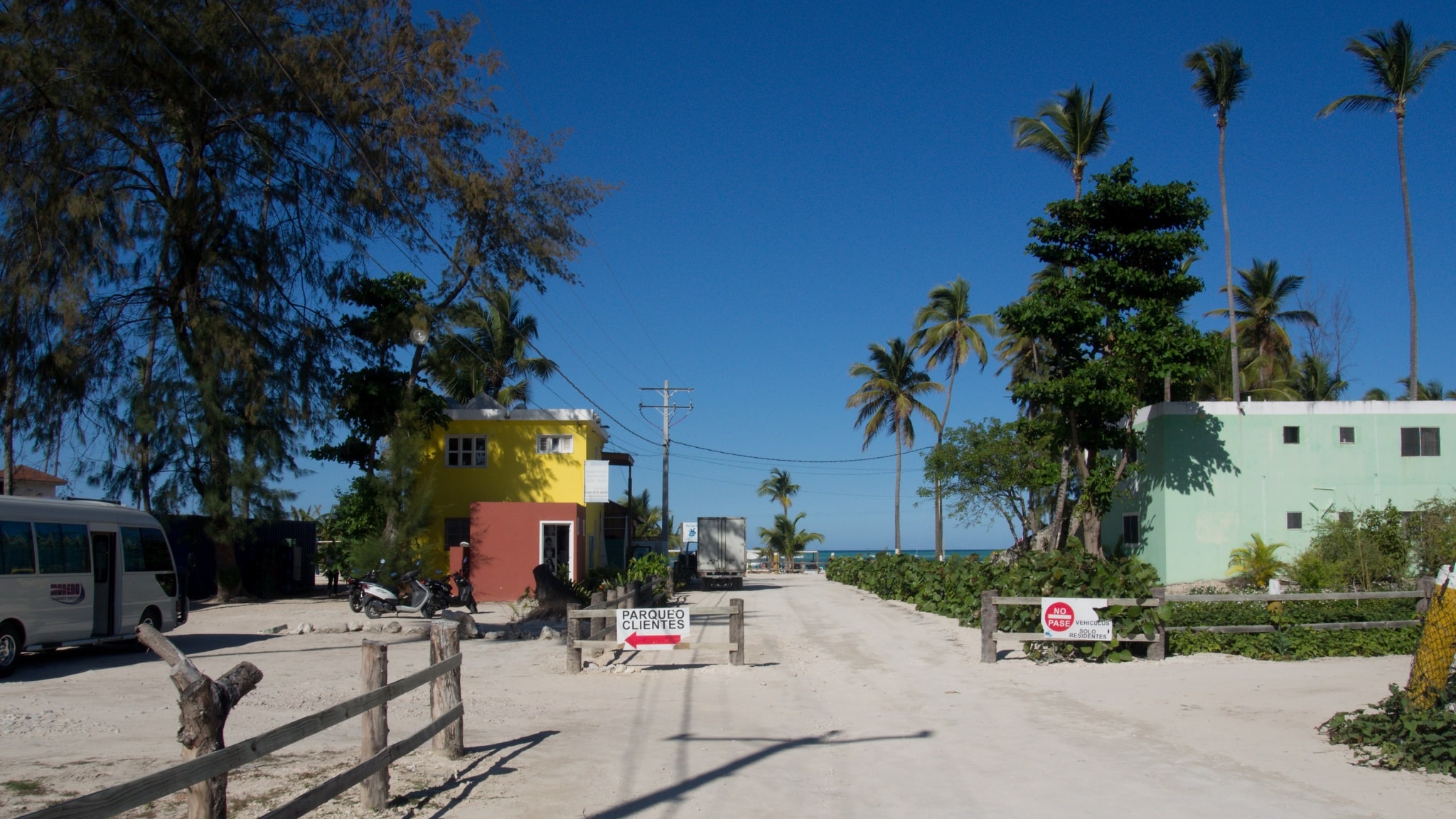
In this article, you’ll learn how you can create the popular and well-known Teal & Orange look, used in Blockbuster hits, with Zoner Photo Studio. We will be working in the Develop Module. Do you want to test out the edits right away but don’t have the right photo on hand? Download our RAW image and get started!
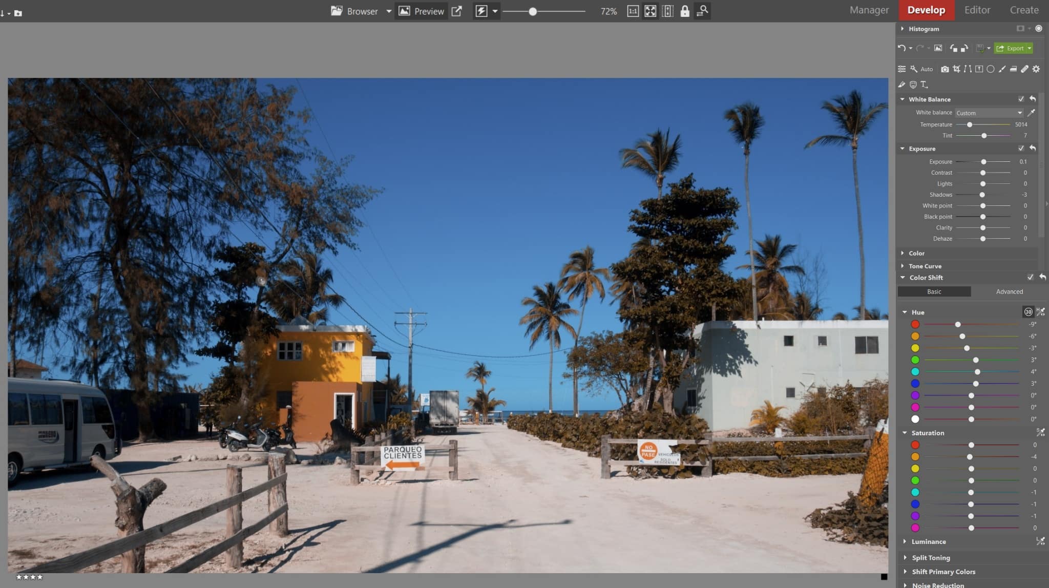
Teal & Orange in the Develop Module
First, we suggest that you even out the tones of your photograph. Correct Exposure and change the White Balance setting to a neutral value. Only then proceed to work with colors.
After completing the rest of the edits, you can certainly return to this slider and fine-tune the final atmosphere of the photograph.

Shift primary colors
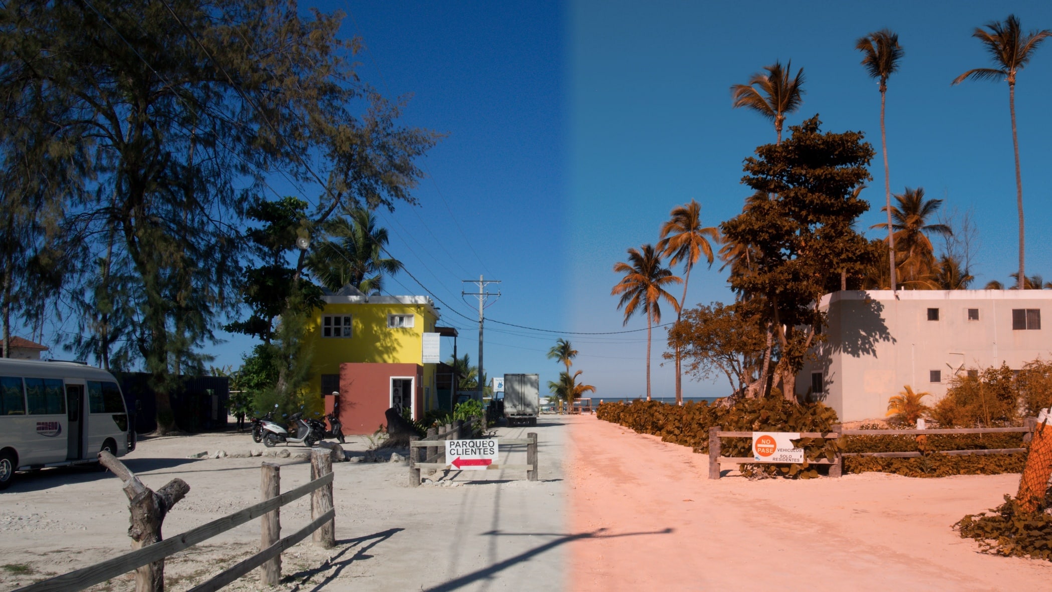
The basic trick for achieving Teal & Orange color grading lies in using the Shift Primary colors tool, which is found in the lower half of the Develop Module. When editing photos, one usually proceeds from top to bottom. However, when color grading Teal & Orange, start at the bottom.
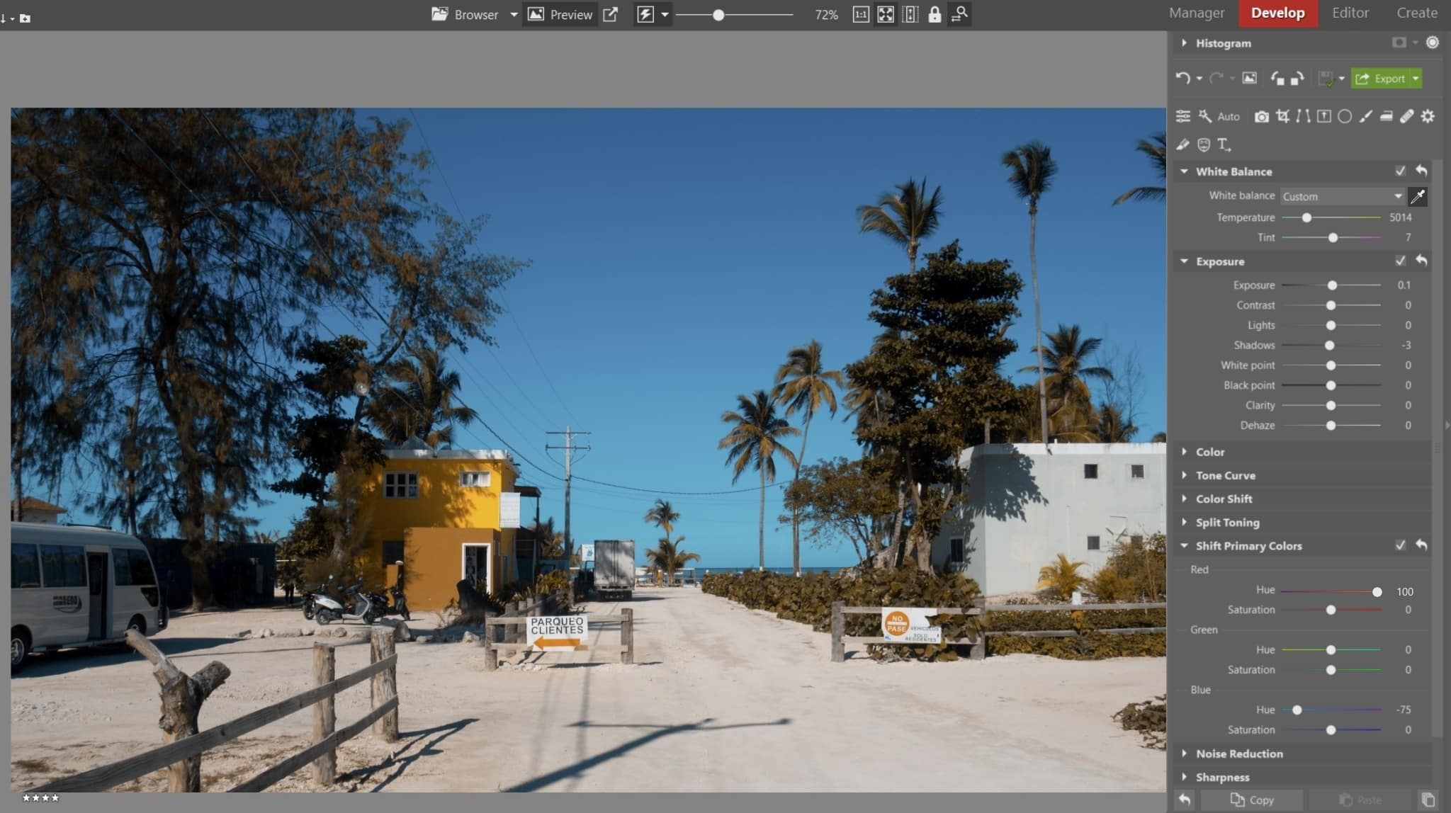
You essentially shift the red and blue hues in opposite directions. Adjust Red hues to their maximum value of 100. Put Blue hues at a value of 75. Again, we can return to these settings again and subtly fine-tune the colors later. With these basic settings, you can’t go wrong, and they’ll work for most photos. Be especially careful with the Green hues slider. If you want to maintain natural colors, don’t touch this slider.
Notice that in addition to changing the colors, you have essentially unified the original color spectrum of the photo. This color property of Teal & Orange is the trick up your sleeve. You can create an aesthetically-pleasing image even from a very plain photo. It will be pleasing to the eye even if at first glance, it will have a limited range of color between shades of orange and sky-blue, which incidentally are complementary colors.
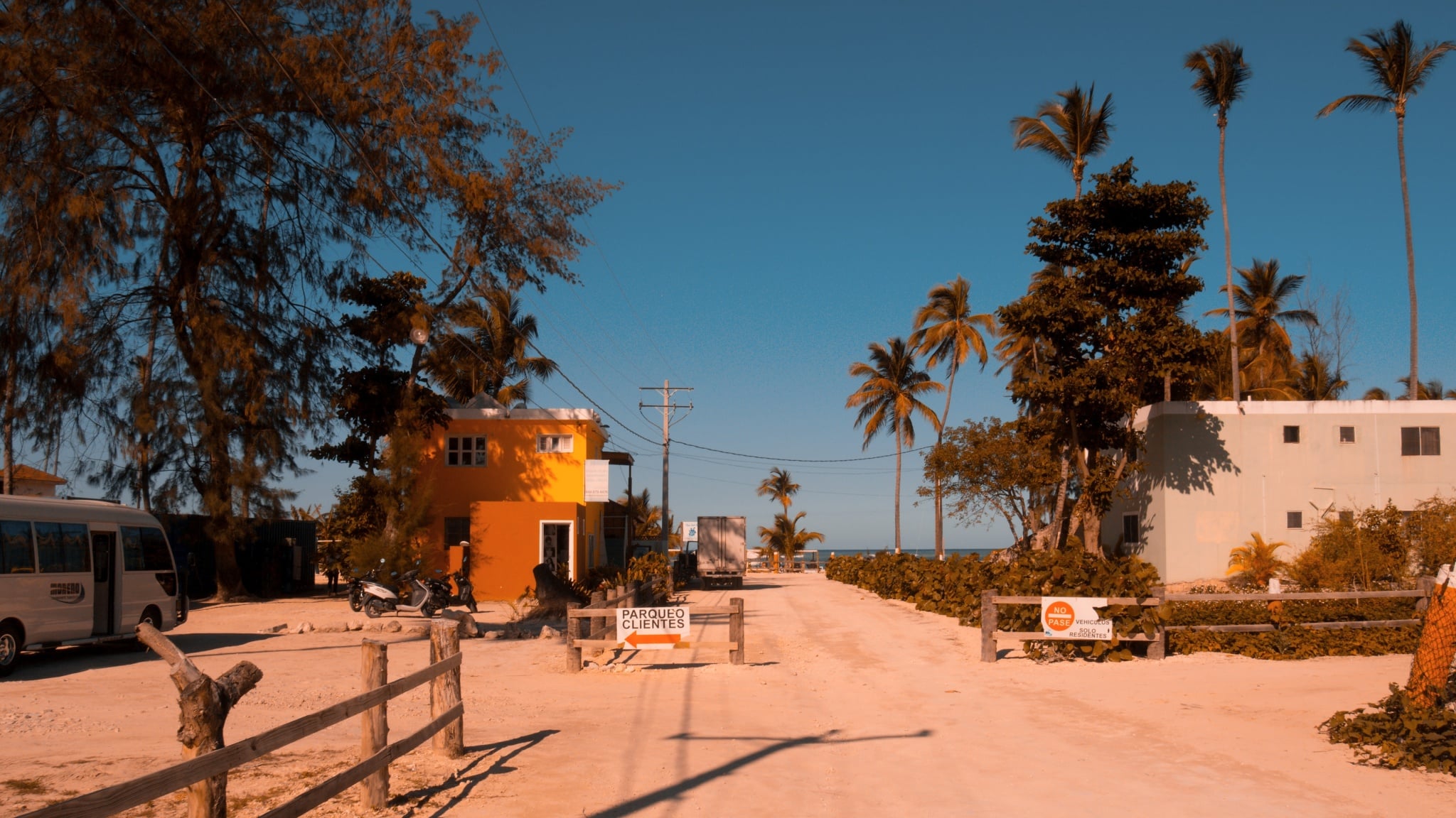
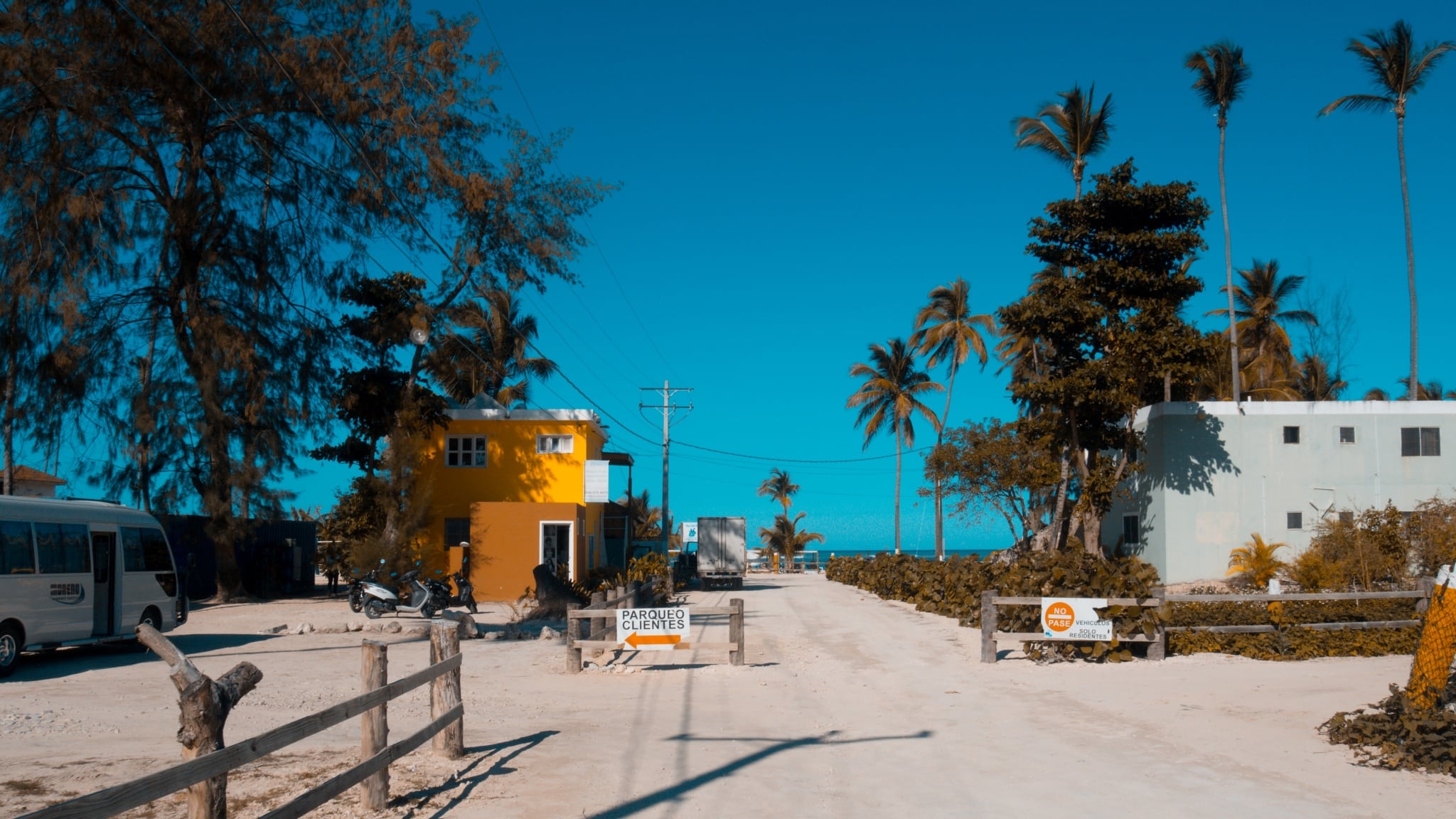
Fine-tuning with Color Shift
In the second step, we will focus on Color Shift. You amplify the effect as follows:
We shift red, orange, and yellow hues to warmer colors, that is, to the left. We edit the rest of the hues according to our creativity. In this case, the blues of the sky were overly saturated and unnatural. I lowered the blue and sky-blue Saturation to a value of -10.


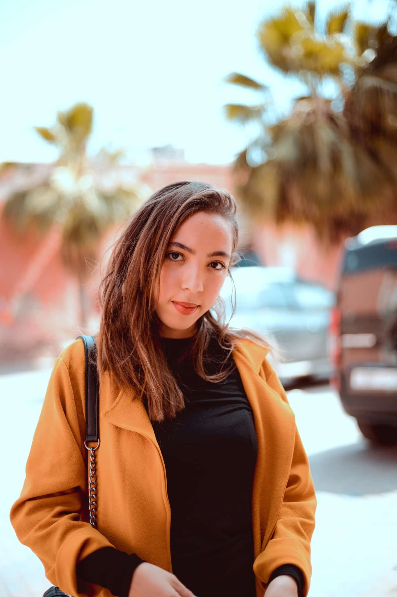
You can cleverly use Teal & Orange Split Toning for portraits, but it’s important to be careful with skin tones.
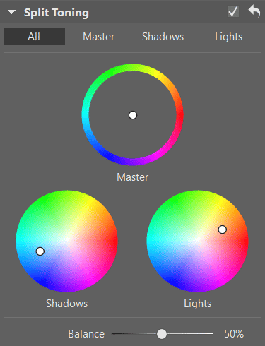
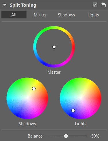
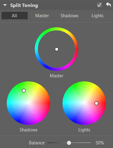
Tried and true Split Toning combinations
Split Toning is another powerful tool you should pay careful attention to when color grading. With Split Toning, you can color hues separately in the lights and in the shadows. In contrast to Primary Color Shift, this process is much more intuitive, giving us specific, harmonious colors noticeable in our natural surroundings.
Objects in the shade frequently have a dark, cold tint represented by shades of blue, while objects illuminated by direct sources of light – like the sun – reflect warm colors with hints of yellow and orange.
In the color theory framework, there are complementary colors, meaning colors on opposite sides of the color wheel. So again, we arrive at Teal & Orange. However, other color combinations based on the same concept are possible. How do we do it?
After basic adjustments to exposure and white balance, proceed to the Split Toning tool and try one of the following combinations:
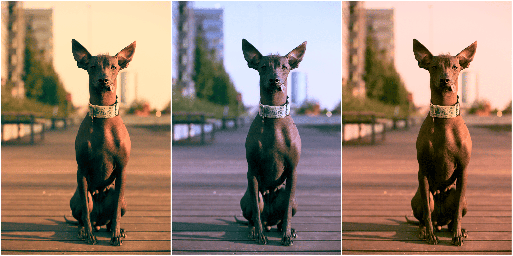
Split Toning is one of the tools you can use to add your own unique color style to use as a “signature.” This makes your work stand out from that of other photographers. When you find a specific combination of Split Toning which works on all your photographs, be sure to save this as a preset for Split Toning.
You’ll then be able to easily apply it to all of your photographs, even those you upload to Instagram. We guarantee that your portfolio with have a consistent and professional look.
Don’t miss out on the previous parts of this series:
Color grading step-by-step I: Color theory
Color grading step-by-step II: Adjust your photo’s colors like the filmmakers do!
In closing
Thanks to the steps in this article, you can change the overall look of your photograph. If you want to change the color of individual objects – cars, clothing, and so on – we still have local adjustment tools which allow you to change hues selectively, using the Radial (R) or Brush (B) filter.
For coordinating and side-by-side split toning, Variants will work great for you. When creating new presets or arranging important photographs in a set, I often leave the first photo without any color shift as a reference to compare the new look.
If you find you don’t like a single color adjustment from any of your photos, it doesn’t matter. Perhaps this photo was meant to stay in its original form.
Download Zoner Studio Free for 7 days and try the many methods of color grading today.
There are no comments yet.