A Photographer’s Digital Indecision

The article is over 5 years old. The information in it may be outdated.
![]()
We are working on its update. In the meantime, you can read some more recent articles.
Digital photo processing opens up huge possibilities—everyone is free to edit photos to match their taste and their mood of the day. But this freedom can sometimes tie you up by leaving you with so many variants that you can’t even choose among them. Or at least, I know it happens to me—all the time.
My inspiration for this article came from a forest photo I took in late November. One day that month a photogenic fog fell and I rushed out to take pictures. I typically look for interesting spots in nature, but while actually taking pictures I mainly worry about composition and technical quality, while expecting to handle white balancing, exposure, and other complicated color adjustments at home. So for me when I’m out in the field, my only goal is to get the best possible raw image data.
So my pictures don’t have the greatest colors out-of-camera… although I do at least make sure they’re free of noise (I shoot at ISO 100) and blowout. And that they’re sharp and in focus, of course. (It’s good to check these things right after each shot in your work, too.)

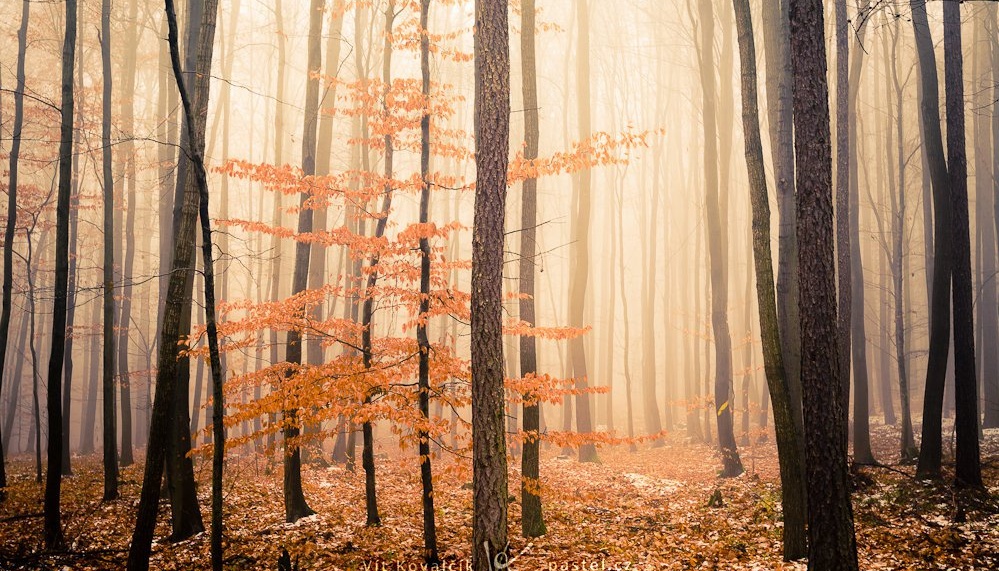
Because I know my Canon’s white balance is a little cold on average, I push it towards yellow back home. But there’s no reason to let the reality of the shot conditions constrain you (especially when you no longer even remember them anyway). Don’t be afraid you’ll pull the sliders too far—remember, you can always pull them back afterwards. You might be surprised by the attractiveness of some of the effects you can get this way. For example when take exaggerated yellows and supplement those with increased saturation, brightness, and contrast, the edges are darkened, and a little blue/yellow toning is added, then you get a picture with a significantly different mood:

But here I started saying to myself: how would it look if I did this? Or that? I ended up falling prey to the curse (?) of the digital age… I saved my existing variant, of course, and then continued my experiments. You’ll definitely notice the continued trek towards orange and the significantly increased contrast in the dark areas:

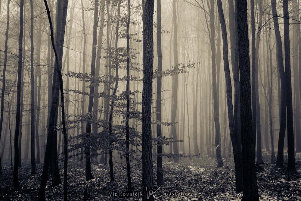
I also tried a purely black and white variant, but it didn’t catch my interest, so I didn’t expand on it. Naturally there is an enormous number of ways to convert to black and white, and so I’m certain that the number of interesting versions even just within the black-and-white realm is huge.

What I did find interesting, on the other hand, was a version with its colors desaturated, making them deeper and more refined. Here I should note that a person should view photos independently in order to judge them correctly—otherwise each photo influences the others. Although this photo seems unsaturated in comparison with the preceding yellow ones, if you were to look at it right after the source photo, its colors would still seem fairly saturated. The preceding black-and-white photo acts here as a bit of a divider.

The last, highly contrasting, almost-grayscale variant has yellow only in its bright tones, and a hint of blue in its dark tones. It just might be the most depressing of all the variants.

With so many versions, I now had no idea which one to choose. So I ran an experiment. I uploaded them all to my Facebook group and let everyone there give their opinion. And it was the old story: talk to ten people and you get twelve opinions. But one variant did at least earn itself a small plurality. The rest of the votes were scattered among the other variants (except for one, which didn’t receive even a single vote). Now I’m curious what people think in a place where I’m much more of a stranger to them, and so my closing question is: Which variant looks best to you?

Terry Byford
Hello, Vit.
An interesting insight. I see that there is evidence of snow, or a heavy frost on the ground, and so none of the variants actually do it for me, because the colour re-balancing is affecting the whole of the image and it makes the trees look decidedly unnatural. Sorry to be negative, but you did ask. :D)
The colour of the leaves in the middle tree is clearly central to the image, in form and intent. I wonder, did you try just a colour dropper from curves just on these leaves to see what happens?
Vit Kovalcik
Hello Terry, I see your point. While I don’t mind blue or yellow snow on the pictures, I understand that it might be bothersome to other people :)
As for the dropper from curves, I haven’t tried that one to change just their color. Maybe a good idea for the next time, thank you!
Terry Byford
Vit, I’ve seen blue snow, but this is just a reflection of the sky. But yellow snow? Now if I saw that I’d start to worry about the amount of wine I’m drinking.:D)
Nick
I like variant 2 best. I find this happens a lot for me, since I am a mediocre photographer, and try to supplement my shots with Nik Effects. There are so many to choose from, and sometimes when you take a decent shot, the options seem to expand, to the point you aren’t sure where you’d like to go from there.