Portrait Editing — Highlighting Wrinkles

The article is over 5 years old. The information in it may be outdated.
![]()
We are working on its update. In the meantime, you can read some more recent articles.
While the fashion photographers are out smoothing wrinkles 24/7 and “digital plastic surgery” tests the boundaries of what ad viewers will and won’t put up with, today we’ll go the opposite direction and let facial features shine. We’re only testing one set of boundaries—those of Zoner Studio.
The source photo was taken in a studio. A single light source was used, without a soft box. It was placed slightly to one side. Thus instead of the typical shadow softening we have shadow strengthening. Our goal for the following edit was to increase the contrast between light and dark areas even more.
Note: For our illustration, we’ve deliberately left out editing of the clothing and the gray background. We chose to focus instead only on the face and hair. But ideally, you shouldn’t ignore any part of the photo when using this technique. The process is the same elsewhere as it is for faces.

Commands you’ll need to know:
Enhance Exposure (Ctrl + 3), Enhance Colors (Ctrl + 1), Paintbrush (B), 1:1 zoom (Num *), Zoom to Fit (Num 0), Sharpen (Ctrl + 5), and Curves (Ctrl + C)
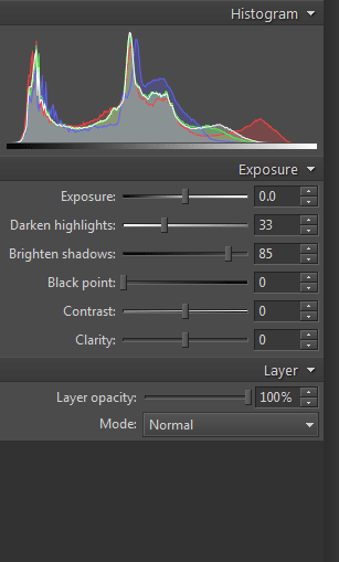
The exact character of local edits like those we’ll be describing below always depends on the photo in question. In some cases you’ll need to start by brightening shadows in the photo to pull color information from the shadows, even though that means you’ll later need to go and move them back towards black. There’s a great tool for this in Zoner Studio. Open a picture in the Editor, visit the Adjust menu, use the Enhance Exposure item, and then in Enhance Exposure, use the Brighten Shadows slider.
But brightening can cause some mild color shifting—pinkish skin can for example turn red and start looking unnatural. If that happens, don’t wait and fix the shifting right away, before making any local edits. Do that using, for example, the Adjust menu’s Enhance Colors command. Even a small shift (less than ten percent) towards the blues and greens can do the trick. Don’t overdo it, or you’ll turn skin yellow or green, which is definitely also bad.
Andrzej Dragan
You can see the results of similar portrait photo editing techniques throughout the work of Polish photographer Andrzej Dragan. High contrast, wrinkle highlighting, and highlighting of the contrast between the light and dark parts of faces make his pictures remarkable. Thanks to his renown, this effect is frequently imitated, usually using edits in Adobe Photoshop. But our goal was to accomplish the same in Zoner Studio. We hope you’ll agree that we’ve succeeded![/box]
Before you start with local edits, create a backup of the original picture (via File | Save As) that you can return to later. Although Zoner automatically backs up originals and helps you restore from them (via an item in the Organize menu), nothing’s quite so convenient and easy to understand as an old-fashioned file-copying backup.
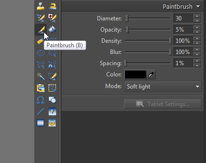
Now activate the Paintbrush tool. The exact settings you’ll want to use for it will depend on the picture you’re editing. For our purposes, we chose a Diameter of 30 pixels (but to cover smaller areas this value should be lower, in the range from 5 to 15 pixels). Use a very low Opacity—you always get more natural-looking results by covering the needed areas multiple times with low Opacity than by using a single stroke at high Opacity. You can experiment with the Density. In some situations the full 100% may be appropriate, while in others you may want to go as low as a quarter of that. The higher the Density, the stronger the effect. The Spacing, meanwhile, should be set to 1% so that the brush moves smoothly.
The last two options set the brush color and the Mode for blending the brush strokes into the picture. You essentially should be working with only two brush colors—black for darkening and white for lightening. A frequent recommendation for the Mode to use in this kind of edit is Overlay, but we used Soft light instead, as it gave us better-looking results.
Graphics tablet
If you have a graphics tablet, plug it in, and then use the relevant icon in the settings for the Paintbrush tool to activate it. We only worked with the brush Diameter, but you can set other properties as needed.
Everything has been easy so far—we haven’t faced any really complicated or demanding tasks. But in what’s to come, your ability to note light and dark areas in the picture will come into play, as will carefulness, patience, and above all, having enough time.
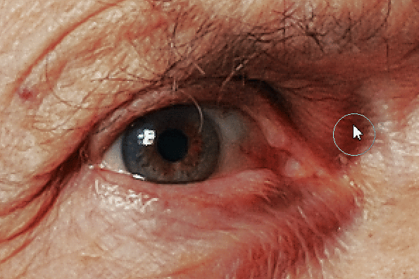
Zoom in to at least 1:1 zoom. As you can see from the illustrations, we zoomed in even more. Set the brush color to black and start brushing over the dark areas in the photograph. Set the brush Diameter based on the size of the area that you are painting over. Don’t be afraid to go down to diameters of even two to five pixels for the smallest wrinkles. Too large a diameter means affecting areas that you don’t want to affect.
Because Zoner Studio doesn’t support multiple layers, you’ll have to “get it right the first time.” That doesn’t at all mean, though, that you just make a few strokes with the Paintbrush and everything’s done. You need to continuously use the Fit to Window zoom level to check that the changes look good there. Then once you are done with the shadows, change the brush color from black to white and work in a similar fashion on the light areas of the face. Don’t forget while you’re doing it to change the brush Diameter as needed and to work on not only the skin, but also the hair (and beard if any).
With this process you are doing the exact opposite of what the touchup artists in advertising studios do—instead of smoothing out shadows and reducing portrait contrast, you are doing the opposite.
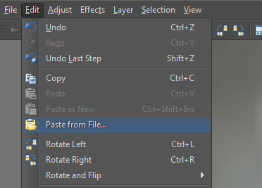
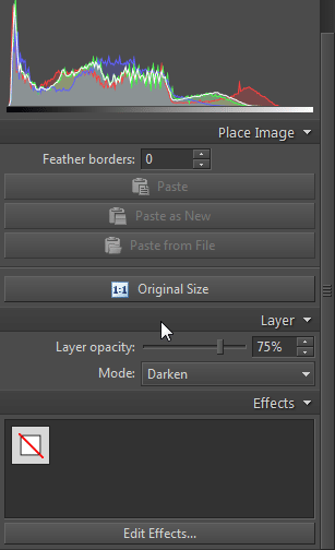
As you can see from the preceding pictures, the changes we made significantly brought out the subject’s facial features. We should note here that we actually did “too good” a job, ended up beyond where we wanted to go, and created a result that lies somewhere out beyond reality. Even though Zoner Studio doesn’t offer layers, there is still a solution for a mistake like ours. We saved the picture, went to the Editor, and opened that backup we made earlier. We then used Paste from File… in the Edit menu, and browsed to the “overdone” version saved just a minute before.
We then changed the Mode to Darken. This caused the pasting to darken the original in areas where the pasted picture was darker. Since our goal was to soften the edit, we avoided maximum Opacity. Instead we lowered it to 75 percent. We then clicked Apply. Then we repeated the procedure, but with Lighten instead of Darken. Here too we did not use maximum Opacity.
We have two more steps to go before we can say our edits are final. We need to sharpen and add contrast. We may also make some other brightness edits if needed. While I personally consider sharpening a necessity (use Adjust | Sharpen for this by the way), I’m less sure about adding contrast. This photograph already has a lot of contrast. Strengthening the ratio between lights and shadows even further could be a step backwards. But if you are using this workflow and you want to add some contrast, go to Adjust | Enhance Colors and use the Contrast slider, or go to Curves and adjust the histogram S-curve.
Wrinkle Smoothing Is Just the Horrible Beginning
Cosmetics advertisers don’t stop at ironing out wrinkles. They actually use a much wider range of what photo editors have to offer. This is because client demands and digital plastic surgery know no bounds. Eyes get widened, noses and chins get molded, teeth get whitened, and it all goes onto our billboards and into our magazines.
Many institutions call these edits misleading; so do many photographers. Perhaps the best known controversy here is the case in Great Britain, whose government is uncompromising when it comes to photo edits in advertising. Brands like Lancome, Maybelline, and L’Oreal have their own stories to tell here, as several of their advertisements with major photo alterations have been banned on the Isles.


The result and the original picture. Use the mouse cursor to switch among pictures.




There are no comments yet.