Strong Composition Through Color Contrasts
Some colors perfectly match, while others strongly clash. But color contrasts are often precisely the way to give photos striking composition.
Our article on using color as a key feature in a photo discussed how to compose via colors—how to use them as a major compositional element. This time we’ll take a closer look at the color spectrum, because you can create some eye-pleasing combinations with contrasting colors.
Contrast Itself
Contrast can be defined as opposition—as the effects of two differing elements. You can find contrasts in shapes, textures, and other properties. But this time we’ll be focusing on color contrasts.
When you look at contrast in the context of color theory, it’s about pairs of opposing colors. When you use one color in these pairs, you can use the contrasting color for an even stronger highlight on whatever you’d like. Naturally it’s good to also combine these colors with thoughtful composition.
Contrasting Colors
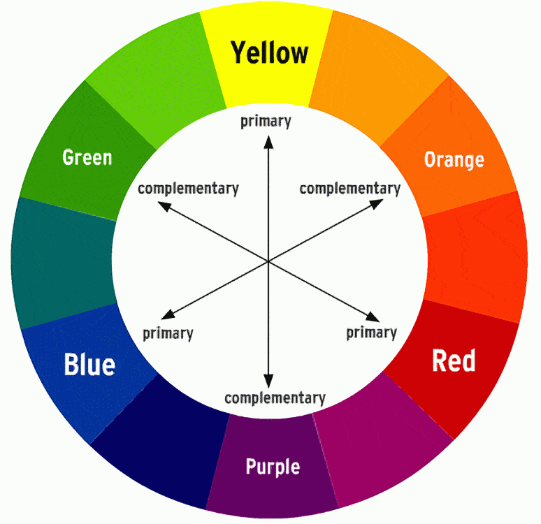
The diagram below clearly shows which colors contrast with each other. Look at it closely, and you’ll find that these are mostly combinations of cold and warm colors. A combination like this gets you the strongest color contrast, and thus draws the most attention.
Using Colors in Practice
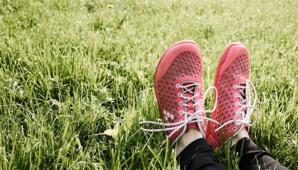
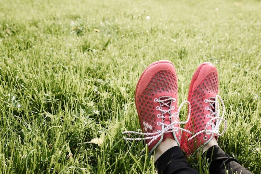
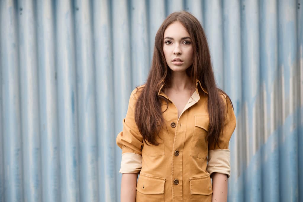
In practice this means that if you want to photograph e.g. a red object, the best thing to do is to find some kind of green background, so it will stand out as much as possible. Experienced photographers have their sites and know what colors to seek. Green places, fortunately, are quite easy to find—get a nicely mowed lawn and you can head out.
If you’re photographing a model, then you can obtain their agreement to wear a certain color that fits the colors in the surroundings of your shot site. These are tiny details, and yet they’ll bring you a much better photo.
Great for Photographers and Graphic Artists
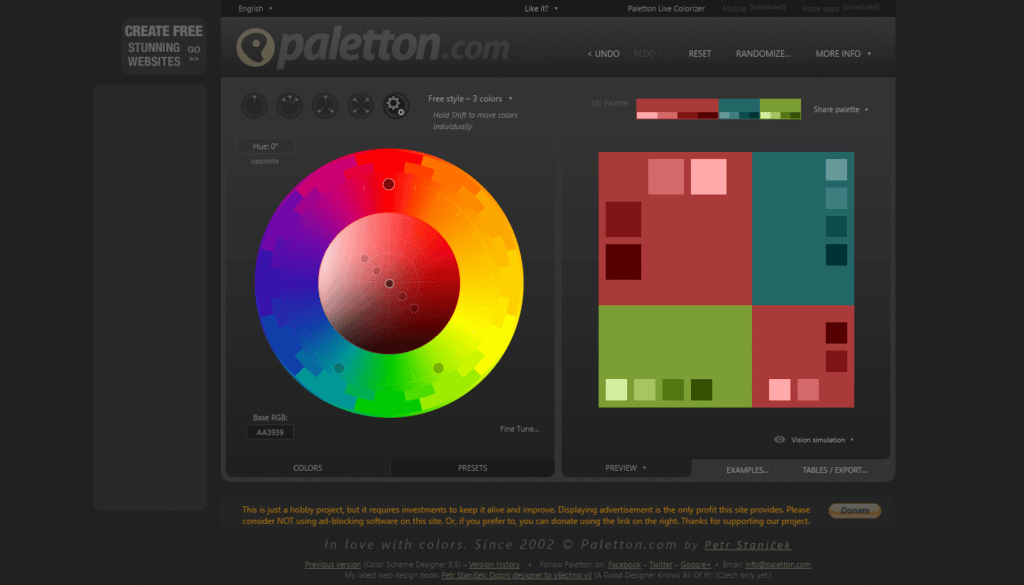
Start your web browser and enter the phrase “color calculator” in your favorite search engine. You’ll get links to various “color calculators.” These show colors and the best way to combine them. You’ll find out which opposing colors are great complements and which ones not at all.
Color Combinations in Photography and More
Color is used in other areas too. The most typical example is fashion. If you love fashion, try transferring the colorfulness of clothes into photography. Or if colors in photography aren’t a problem for you, but clothing is a struggle, try using your photographer’s eye when harmonizing colors.
Humans perceive almost everything visually, and colors are a part of vision. So it’s good to think about colors in your photos and photography. Photographers who get to stage their shots have it easier here than reportage photographers. But this knowledge is still useful in documentary work.
Elaine Hutchings
Thank you! I found this amazing calculator https://www.sessions.edu/color-calculator/#top
Zoner
Great tool, thanks for sharing!