Colors in Photography: What the Colors in Your Photos Communicate
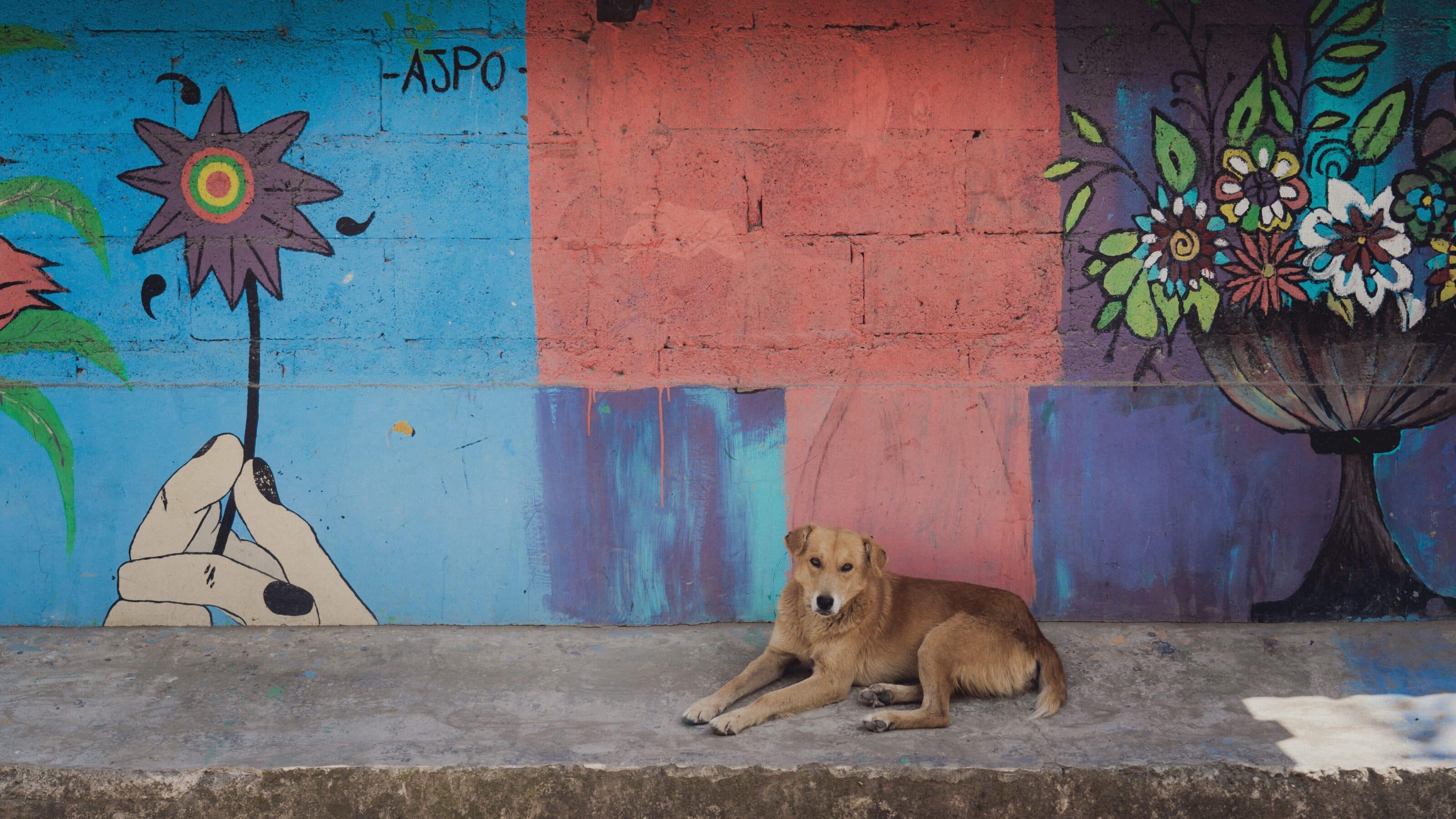
The decision to shoot in color or black and white is an ongoing debate among many photographers. Both have their passionate supporters. Ultimately, it all depends on what you want to convey with your photo and how you choose to do it. We’ve prepared a guide to colors in photography and how different colors can affect the mood and meaning of your photos.
Both black and white and color photographs are tools for conveying your message. The deciding factor is that color adds a new dimension to your photography, providing another means of expression. In this article, we’ll break down what specific colors communicate and how they can enhance the meaning of your photos.
Photographers have many tools at their disposal: rules of composition, the exposure triangle, and lighting techniques. Color is yet another creative tool. It can elevate your photo, but it can also easily undermine an otherwise good shot. That’s why it’s important to master the basics of color theory and study the pioneers of color photography, such as William Eggleston, Martin Parr, Saul Leiter, Joel Meyerowitz, and Alex Webb.
White
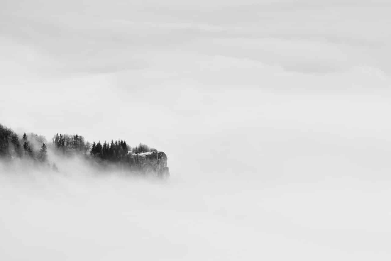
In Western culture, white is primarily the color of purity and innocence, in addition to simplicity, enlightenment, hope, goodness, and peace. It is also a symbol of new beginnings. White is a popular color for minimalist compositions, especially for architecture. It emphasizes the purity of the lines or can serve as a background for portraits. White is neutral, so there is no color that doesn’t go well with it. It is especially effective when combined with black or as a minimalist backdrop for other colors.
Black
Black evokes associations with the unknown and mystery. It is the color of night, concealment, and darkness—things we cannot grasp or recognize. It is associated with emotions of sadness, loss, and death but also formality, elegance, prestige, and power.
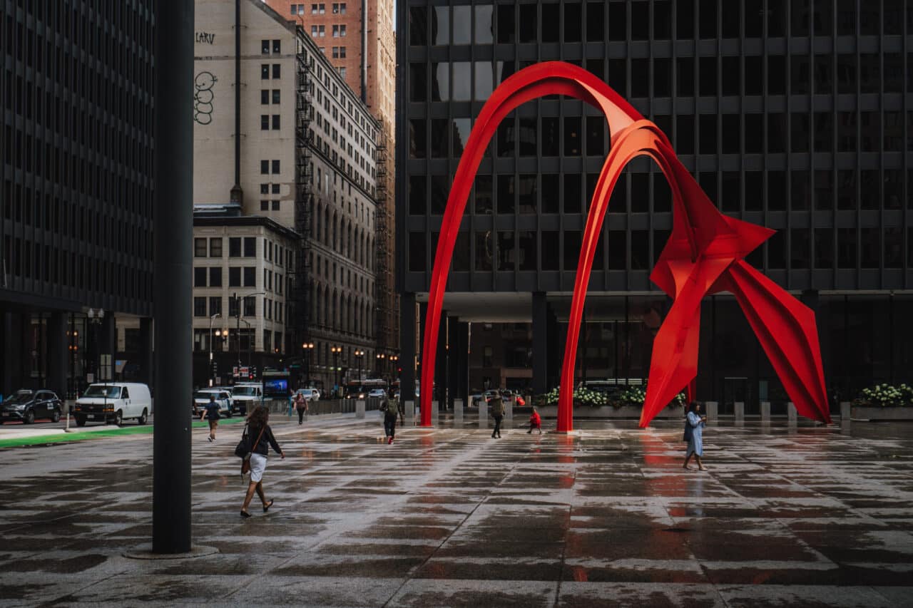
Like white, black is a universal color that goes well with all other colors. It’s up to you to decide what you want to communicate with black. A timeless combination is black and red, which expresses vitality, strength, and passion. However, be careful. In large amounts, black can become overwhelming.
Green
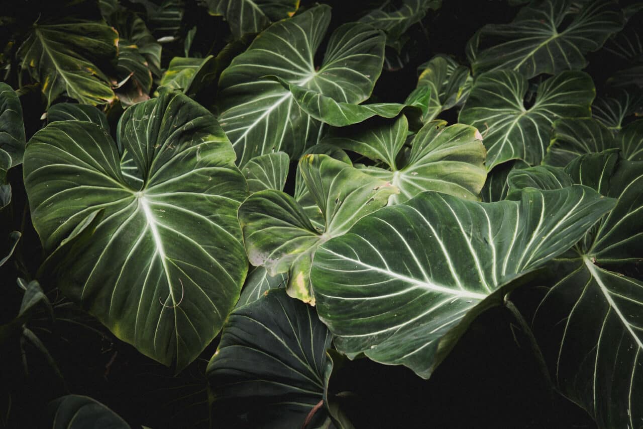
Nature, money, traffic signs, toxicity, growth, freshness, healing—this is just a brief list of how versatile the color green can be. In our subconscious, however, it is most associated with nature, particularly for its calming, regenerative, and life-giving power.
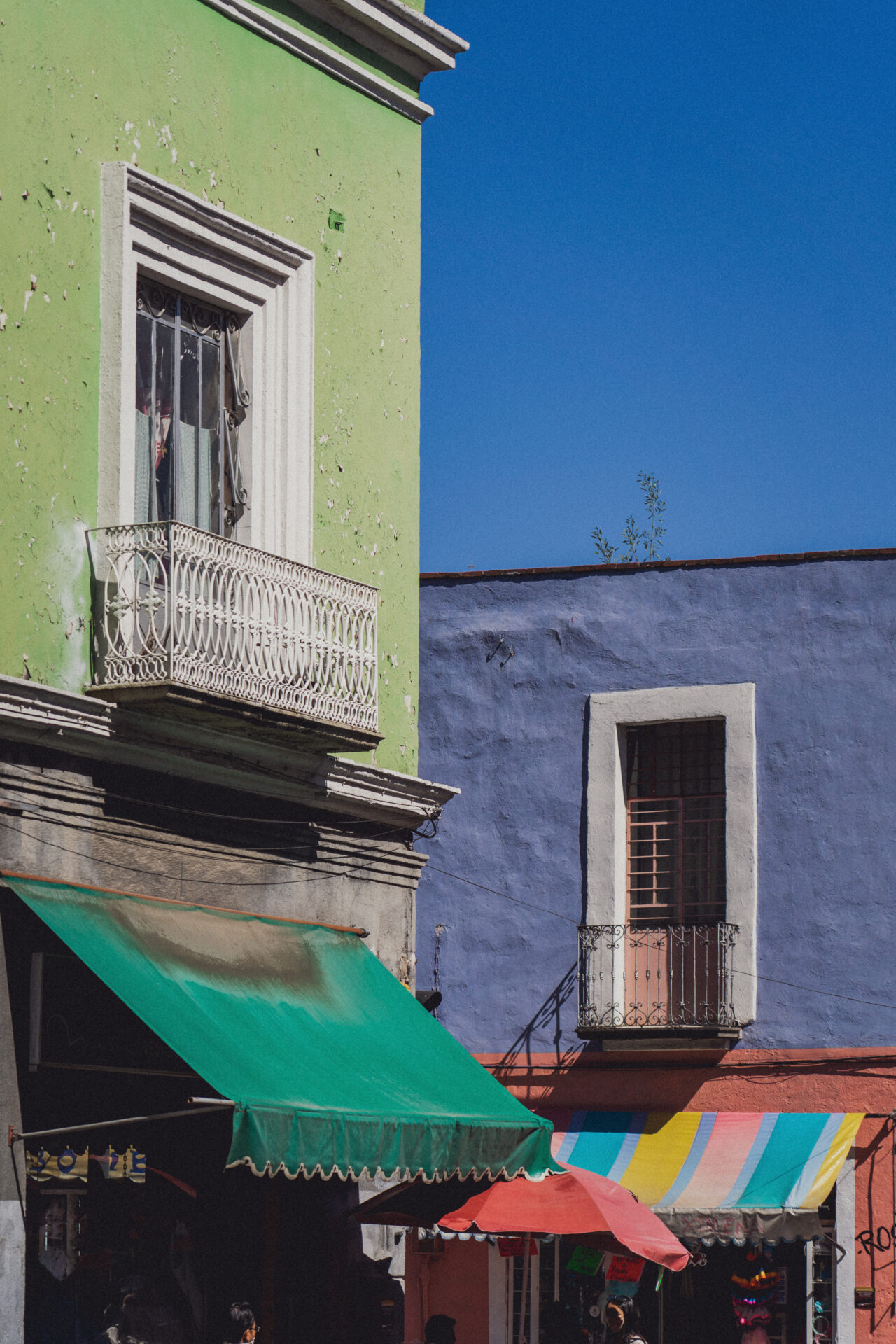
The complementary color to green is red. Together, they create interesting dynamics in a photograph and are a popular combination in color street photography.
Blue
The sight of the endless ocean or a deep blue sky evokes a sense of calm and harmony. That’s why blue is often found in hospitals or offices. Blue is calming and brings peace. However, it can also be the color of tears, winter, and ice.
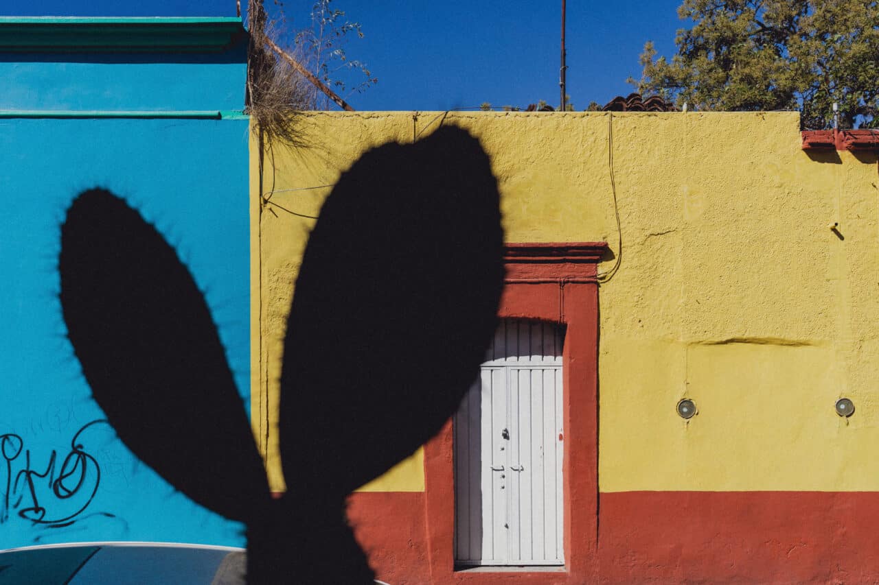
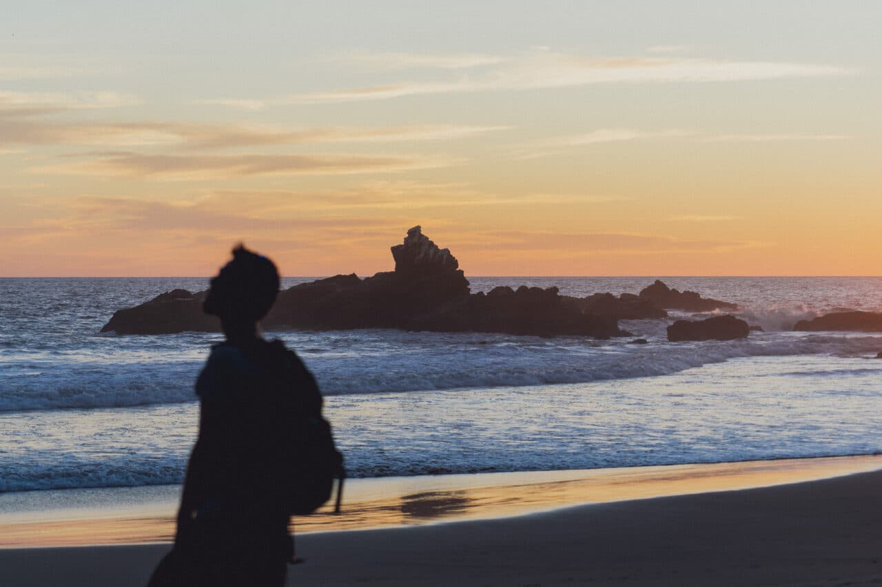
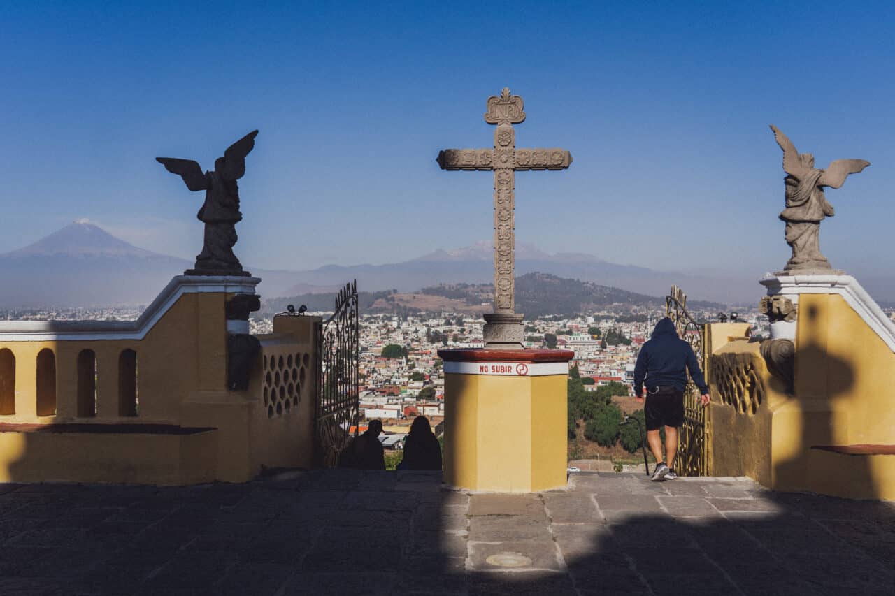
Blue is a cool color, so you can achieve a striking contrast if you pair it with yellow or orange. The cold and seriousness of your photo then is balanced with a positive warm color. The often-overlooked combination of blue and green, two adjacent colors on Newton’s color wheel, also works well. Think of the calming effect of green grass and a blue sky.
Yellow
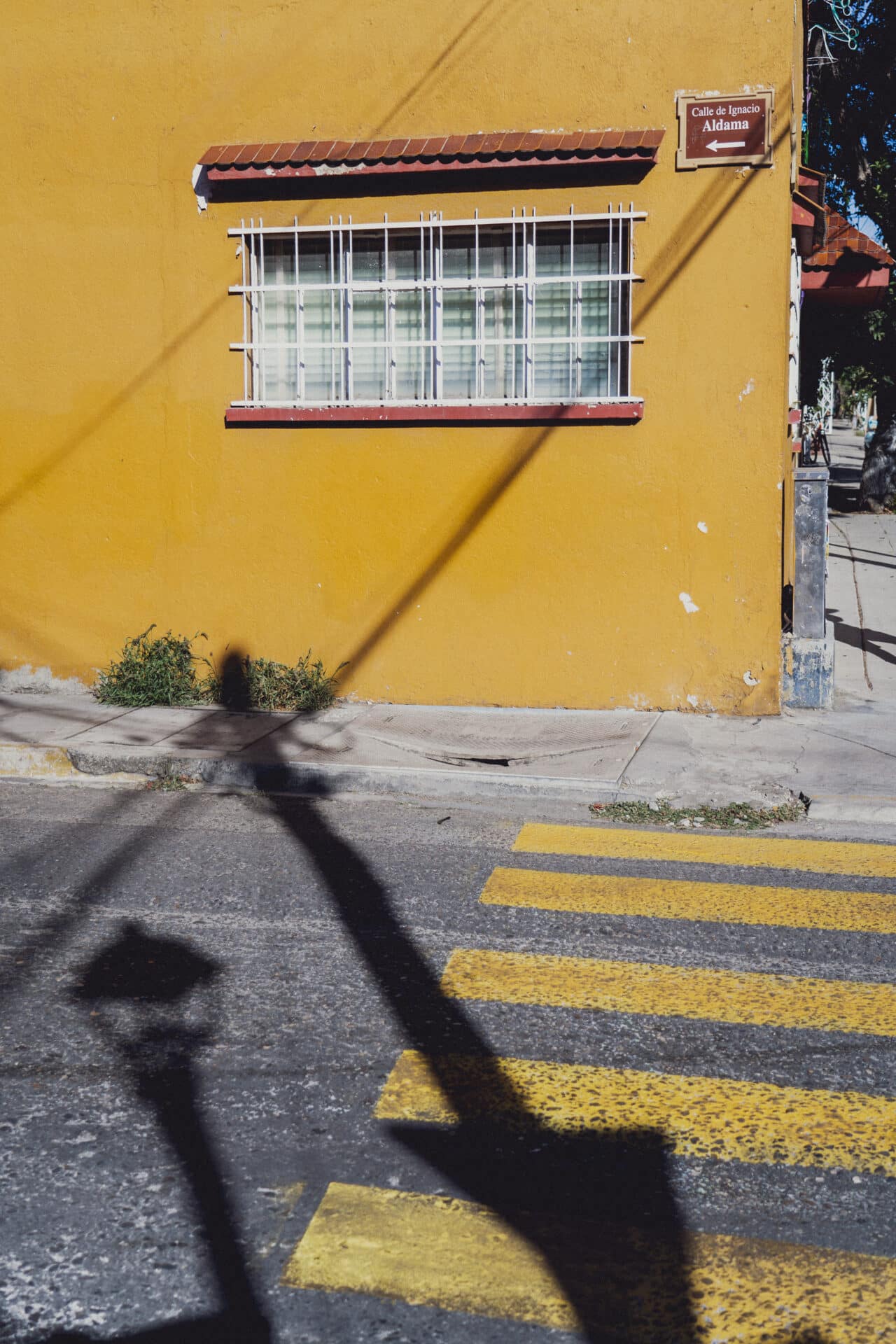
In both photography and art, yellow is primarily perceived as the warm color of the sun. For photographers, it is associated with the beautiful evening light that magically illuminates the landscape. Yellow is the brightest color in the spectrum, if you exclude white.
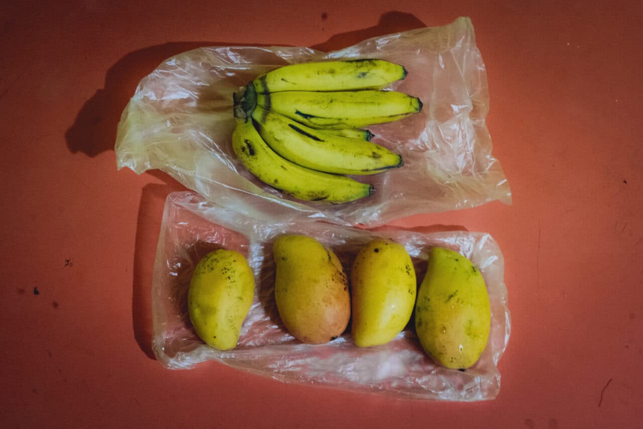
Yellow emanates feelings of freshness, energy, and vibrancy. However, prolonged exposure can also tire the viewer. Still, we mostly associate it with positivity. Think of the sweetness of honey, a ripe mango, shiny gold jewelry, or the warmth of a sunny beach.
The complementary color to yellow, or the color opposite on the color wheel, is purple. However, the most commonly used combination in photography is the above blue and yellow, which can be found almost everywhere in nature. Yellow also pairs well with gray, white, or black.
Red
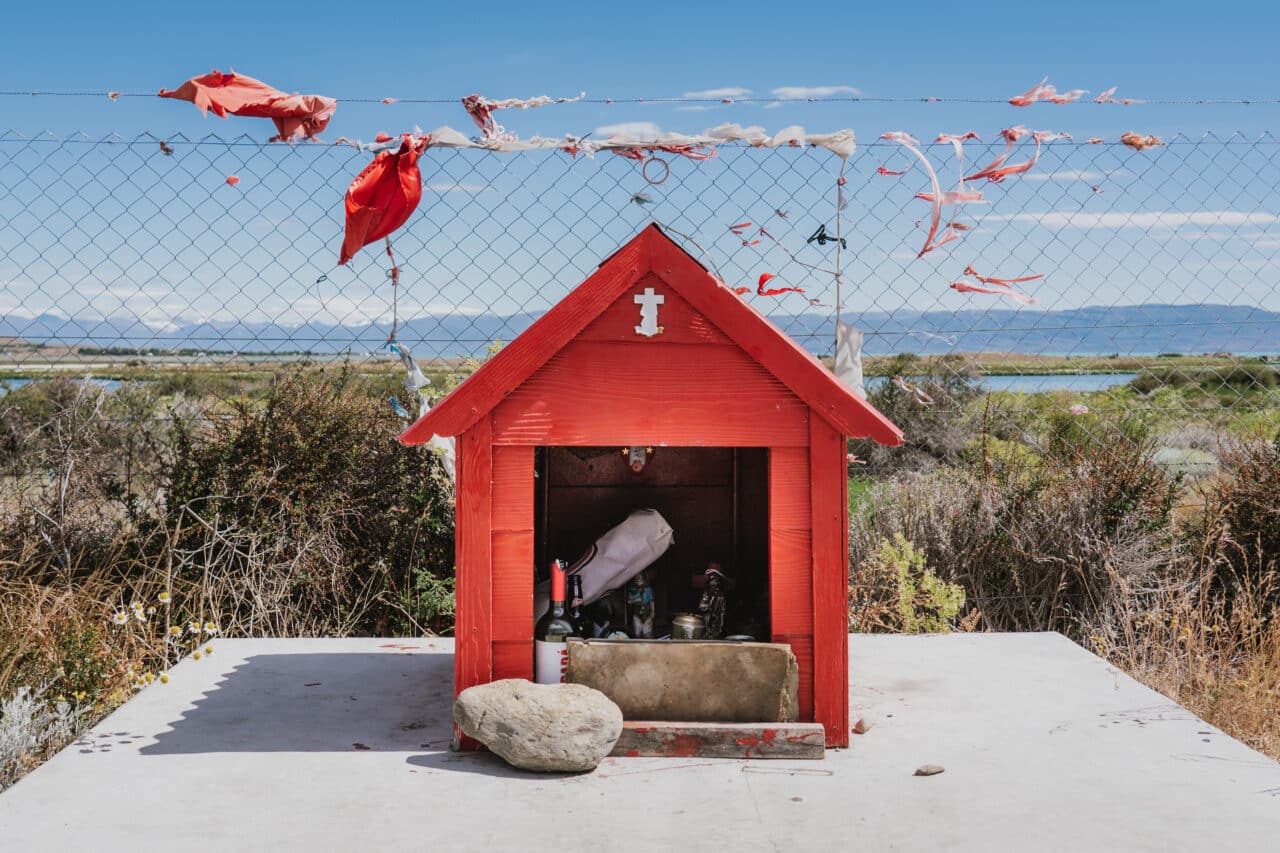
Red is one of the most striking colors in the spectrum. It can evoke a range of conflicting emotions. For some, it is a symbol of romance, love, and passion. For others, it represents aggression, violence, and war. But one thing is certain: this color rarely leaves you feeling indifferent. You can include red in different contexts, play with its meanings and interpretation.
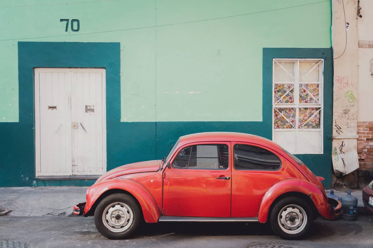
The complementary color to red is green. Analogous colors are yellow (or orange) and purple. These combinations create harmony and even a cheerful atmosphere in photos. They go well together and tone down the intensity of red. Another interesting combination is red and blue, where the warmth of red is tempered by the coolness and calm of blue.
Purple
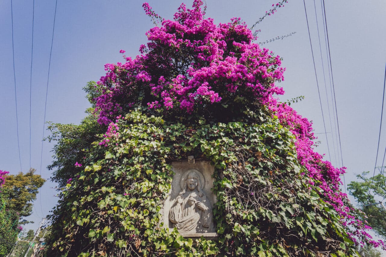
It’s no coincidence that purple is known as the color of royalty. Purple is associated with nobility, luxury, dignity, and wisdom. Perhaps because it is rare in nature, purple is also linked to mystery, exoticism, spirituality, and magic. A combination of blue and red, purple has attributes of both. This leads to a conflict between calm and passion, harmony and chaos.
Did you enjoy this article about colors in photography? Read more about each of the colors described in these articles:



There are no comments yet.