128 128 128. That’s the color code for neutral gray. And neutral gray is extremely important for digital photography. Not only because it’s easy to “hide” (to make it neutral, translucent), but also because you can us this color to easily balance all the other colors in a picture… or even in other pictures.
The article is over 5 years old. The information in it may be outdated.
We are working on its update. In the meantime, you can read some more recent articles.
128 128 128. That’s the color code for neutral gray. And neutral gray is extremely important for digital photography. Not only because it’s easy to “hide” (to make it neutral, translucent), but also because you can us this color to easily balance all the other colors in a picture… or even in other pictures.
Gray cards are used for white balancing. White balancing, in turn, is very important for ensuring that all of the photos in a shoot have the right colors.
Practically speaking, a gray card is a little sheet of cardboard that’s gray in one part and white in another. It costs about 5 dollars, and it shouldn’t be missing from any photographer’s bag. Besides correct white balance, a gray card can also be used in exposure metering, although we won’t be going into that in detail here. That’s because a gray card represents a scene with an average gray level, and with help from it you can get the best exposure settings for reflected light.
Using Your Gray Card
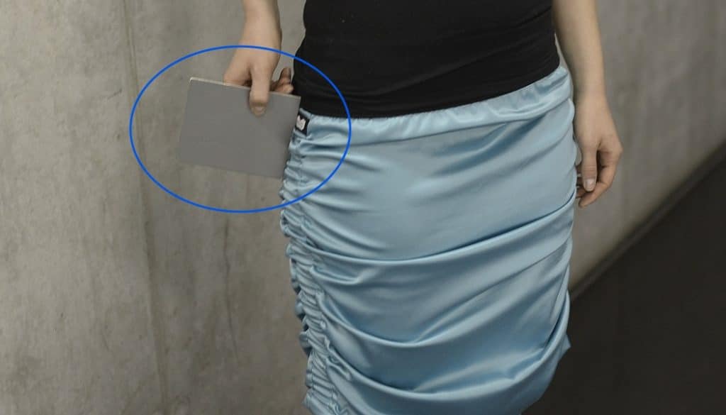
The first photo you should take in any place where you’re doing a shoot is a gray card photo. The gray card photo doesn’t need to be perfect, but it does need to capture the gray card’s color.
Using this photo, you can get the correct color settings for a site, which you then apply to all the photos taken at that site.
Your gray card photo does not need to be technically flawless; it just has to capture the card’s color.
When Should I Take a New Photo of the Gray Card?
Make a new gray card photo each time the light changes. So, if the sun slips behind a cloud, or slips out from behind one, sigh if you want to, but take a new gray card photo. The same applies if you switch sites. The light intensity and temperature in the new site can be completely different, so always keep the card in mind and in use.
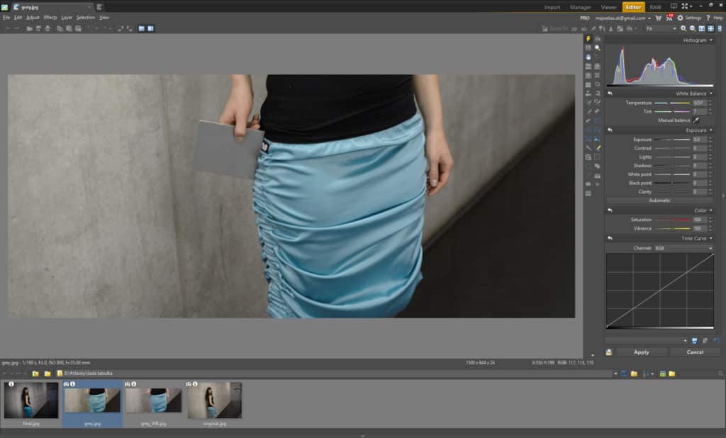
When you go to make edits on your computer, you’ll be glad you did. For example when using the white balance controls in the Zoner Studio Editor, click with the Eyedropper anywhere on the gray card. This will give you precisely the right value for white balancing. Then apply that value to all the photos taken in the same light.
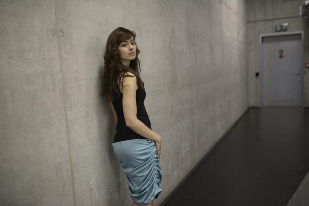
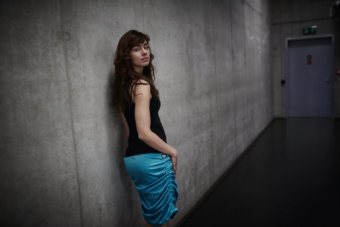
White balancing via eyedropper. Use the values measured here on the remaining photos as well.In these conditions you can’t really rely on automatic white balance.
Hey, What About Automatic White Balance?
Modern digital cameras have quite decent, faithful colors, and so it can seem like using a gray card is just a waste of time.
But you’ll be glad you used a gray card whenever you’ve got multiple light sources in a photo, for example daylight mixed with artificial light. These differing color temperatures can break the “confidence” of the camera’s automatic white balance system, causing it to give incorrect colors. That’s why it’s better to use a gray card.
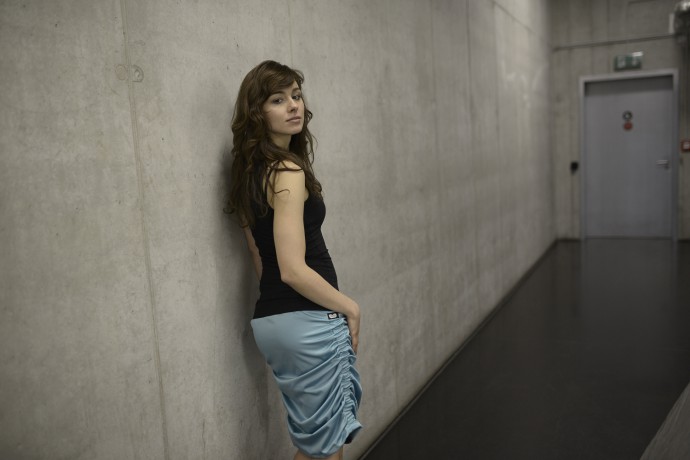
Before picture: In these conditions you can’t really rely on automatic white balance. After picture: The final, edited photo with the right color temperature.
Gray cards are cheap, and they can save you tons of work and headaches. This photographer’s aid should be in every accessory bag.
Receive our weekly newsletter to stay on top of the latest photography trends
Subscribe to receive the best learn.zoner.com has to offer
By confirming the subscription, you consent to the processing of your personal data for receiving newsletter. Learn more in our privacy policy.
I’ve been taking pictures since 2004. When I was starting out, I photographed almost everything. Later my style solidified and I began photographing people almost exclusively. At the moment my main genres are fashion and advertising.
The “Before” picture is a photo taken by the camera, “After” picture is the photo after edits – well white-balanced picture. You can see the color diference when using the slider.
But thank you for the feedback, there could be a better explanation. We will add it to the article.

Fred J. Basham
A very illuminating article, indeed.
Ian
A better explanation of the last picture here would be great… It is as if something (text) is missing
Zoner
The “Before” picture is a photo taken by the camera, “After” picture is the photo after edits – well white-balanced picture. You can see the color diference when using the slider.
But thank you for the feedback, there could be a better explanation. We will add it to the article.